


Your Competitive Edge in the Digital Marketplace
The Mobile-First Web Design Revolution
In a world where mobile devices drive over 60% of website traffic, ensuring your site is responsive is essential for meeting user expectations and maximizing engagement. Studies have shown that 57% of users say they won’t recommend a business with a poorly designed mobile site, and 40% have turned to a competitor’s site after a bad mobile experience. These statistics highlight the critical importance of responsive web design for businesses in Dallas.
Responsive web design ensures your website adapts seamlessly to any screen size, providing an optimal viewing experience and a consistent brand identity across all devices. This means no more zooming, pinching, or sideways scrolling for your visitors, regardless of whether they’re on a smartphone, tablet, laptop, or desktop computer.
Instead, they get a user-friendly experience that keeps them engaged and encourages them to explore your site and consequently convert into customers.
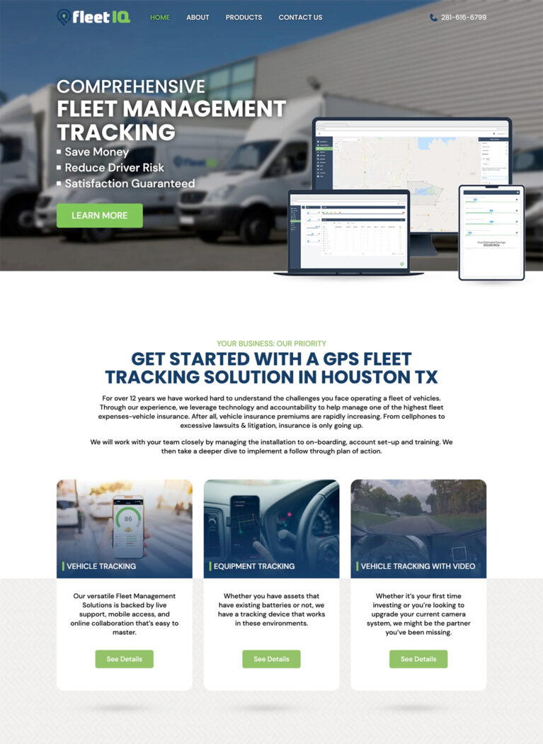
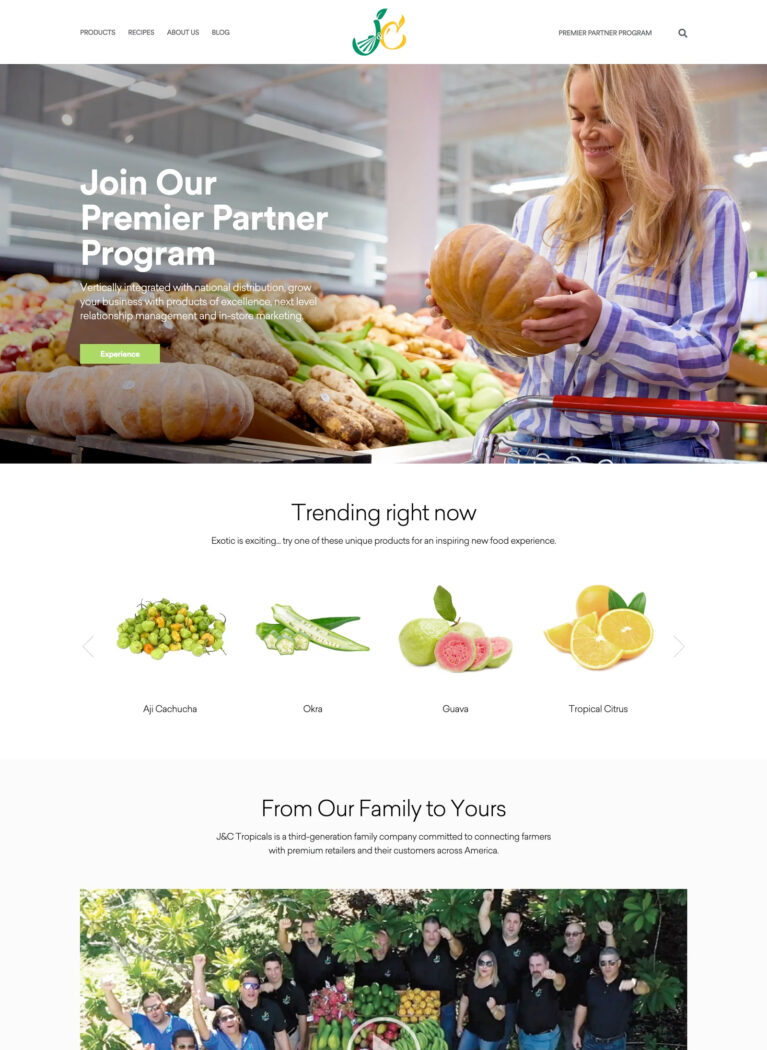
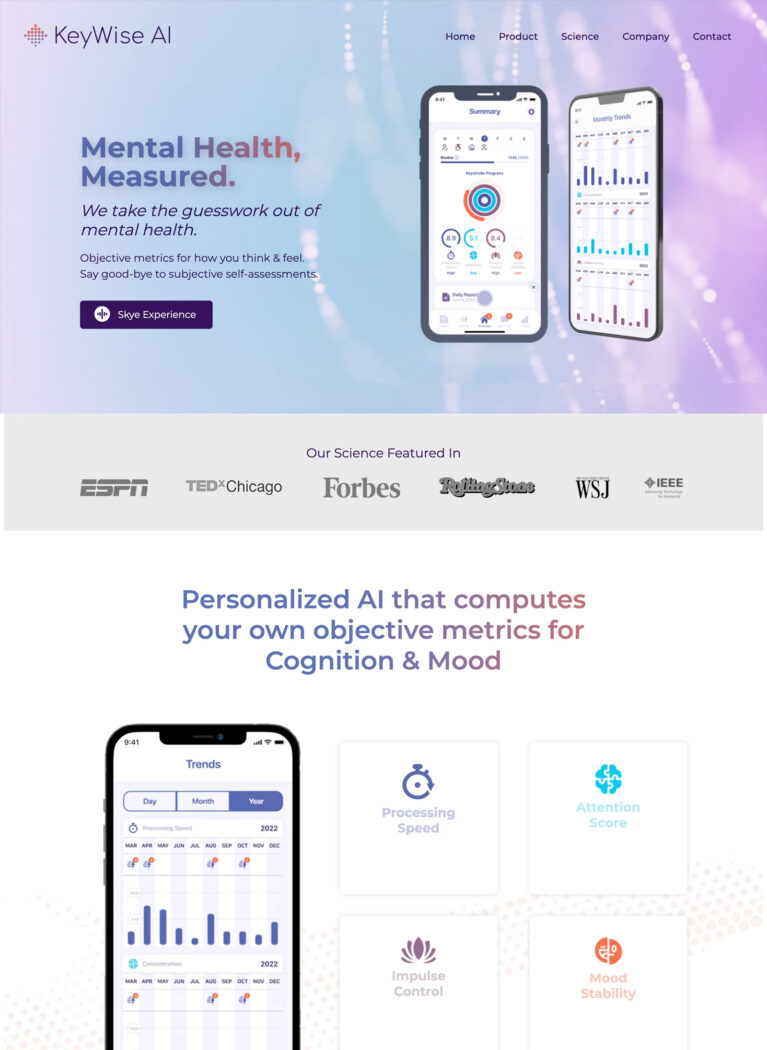
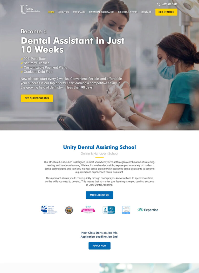
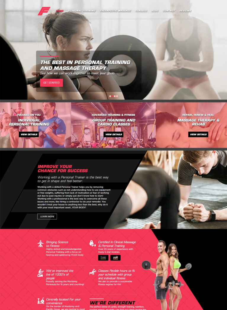
Bless Web Designs is a leading web design company in Dallas, with over 15 years of experience creating exceptional, mobile-friendly websites for businesses of all sizes. We prioritize creating responsive websites that provide a seamless experience for your users while focusing on delivering real results for your business. Our goal is to ensure your online platform is both visually impressive and performance-driven.


- 1 / 5
- 2 / 5
- 3 / 5
- 4 / 5
- 5 / 5
What is Responsive Web Design?
Flexible Layouts for Modern User Needs
Responsive web design is a web design approach that provides an optimal viewing and interaction experience for users regardless of their screen size. Whether someone is viewing your website on a widescreen desktop monitor, a laptop, a tablet, or a smartphone, the layout, text, and images will automatically adjust to fit the screen, providing a user-friendly experience.
This differs from traditional web design, where websites were typically designed for desktop computers only. With the rise of mobile devices, this approach led to frustrating experiences for users. This is where responsive web design comes in, ensuring your website looks great and functions perfectly on any device.
Responsive web design also differs from adaptive web design. While both aim to provide a good user experience across devices, adaptive web design uses predefined layouts for specific screen sizes. In contrast, responsive web design uses fluid grids, flexible images, and media queries to adapt the layout dynamically to any screen size.
This provides a more seamless and consistent experience across a wider range of devices. By implementing responsive web design, you can ensure your website is accessible to everyone, regardless of the device they are using.
Key benefits of responsive web design include:
- Improved user experience (UX)
- Increased mobile traffic
- Better SEO
- Higher conversion rates
- Enhanced brand consistency
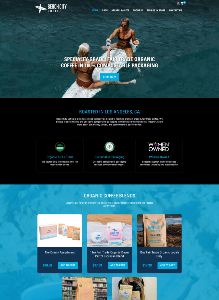
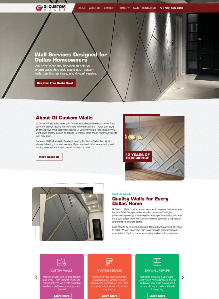
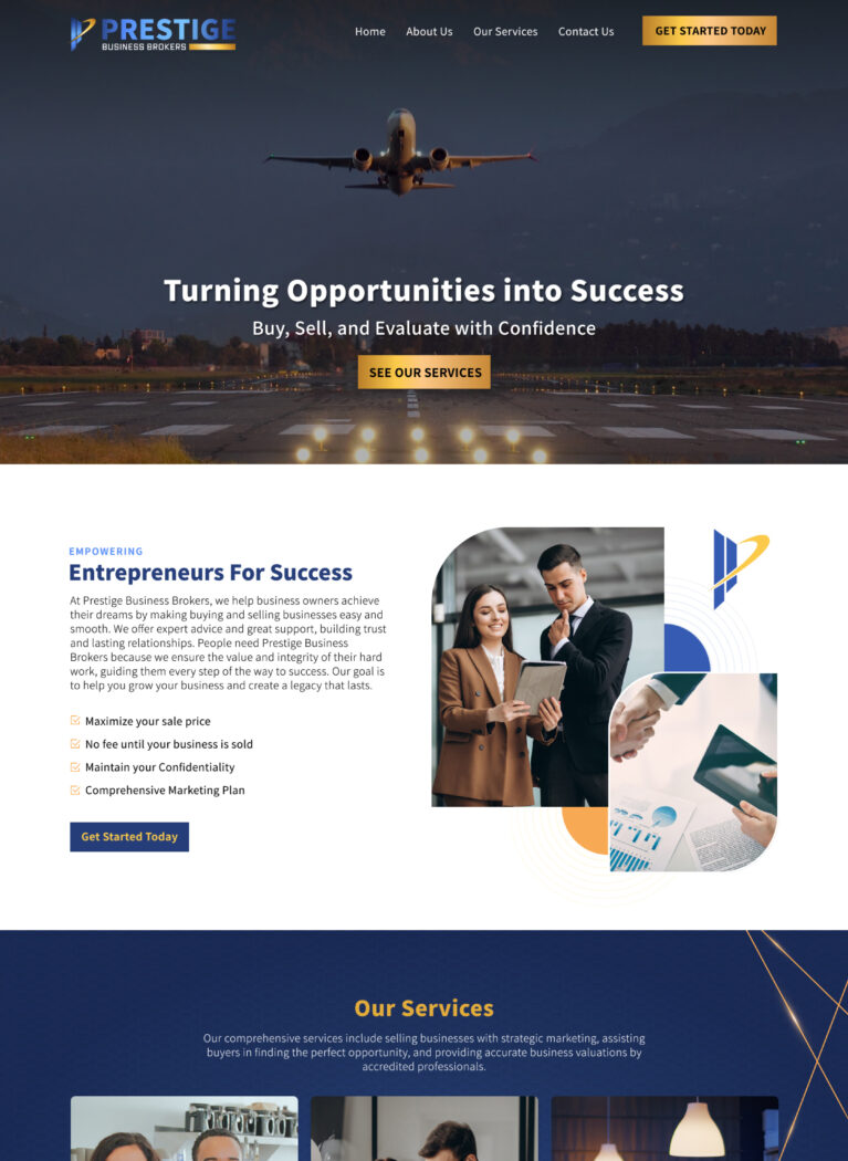
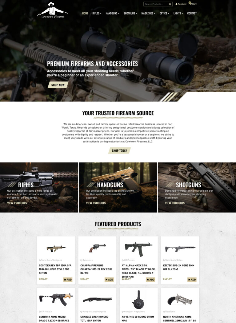
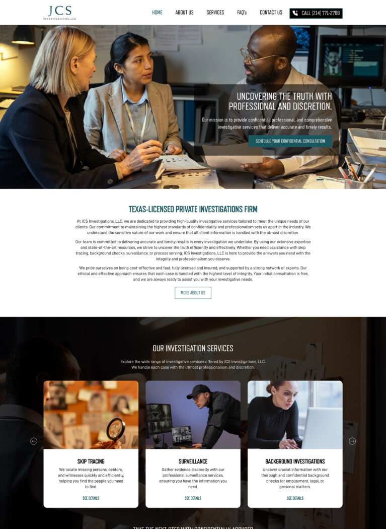
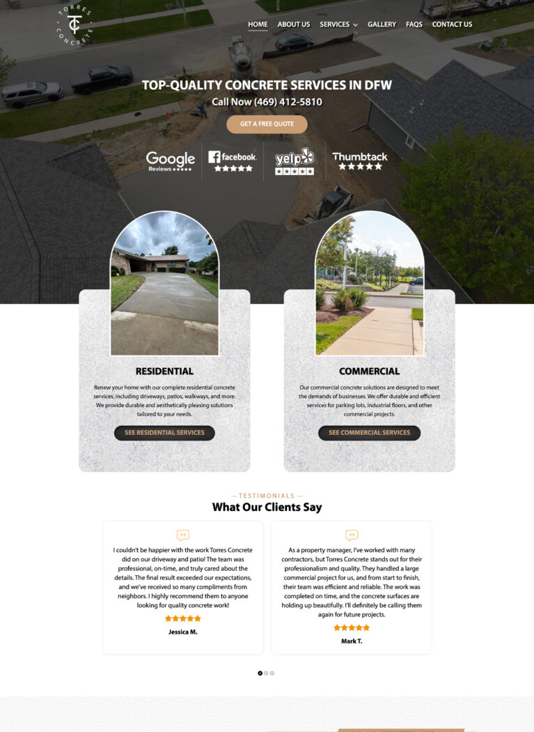
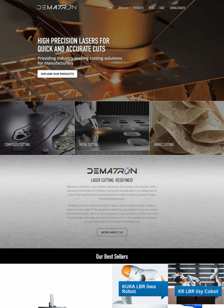
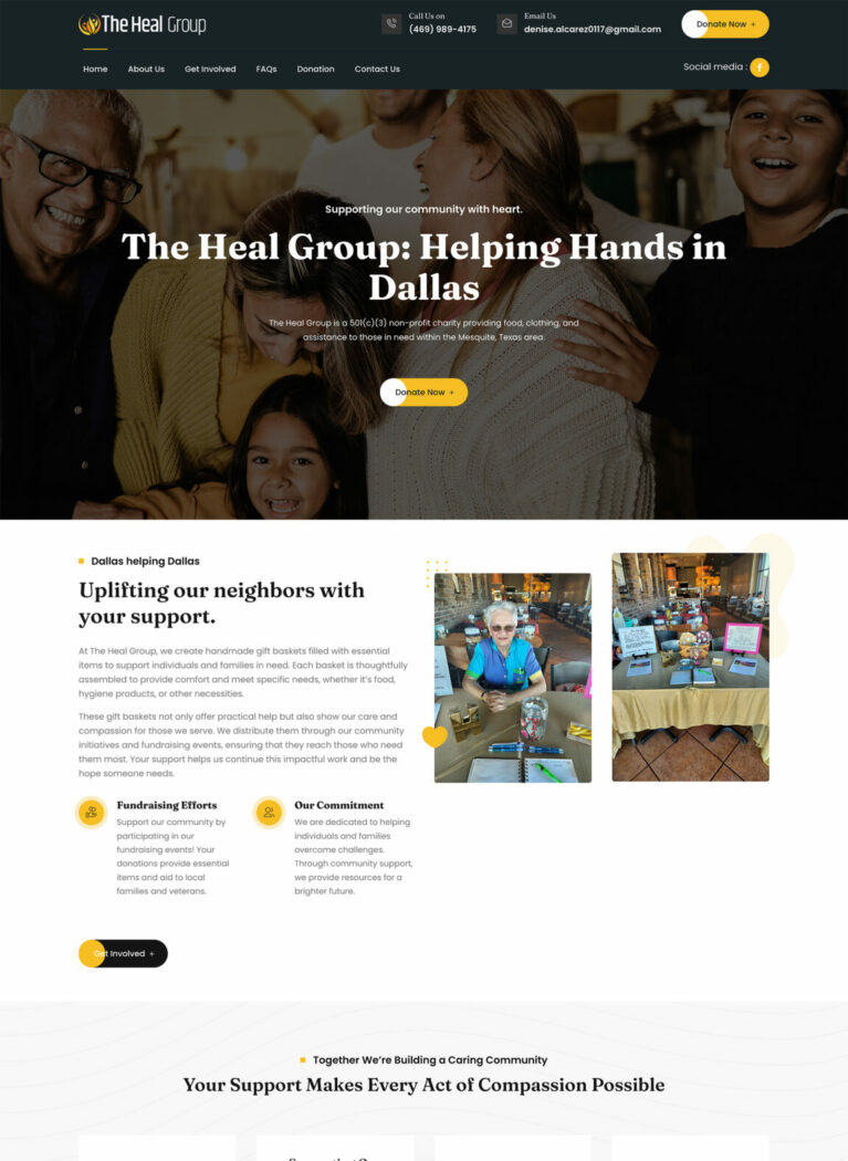
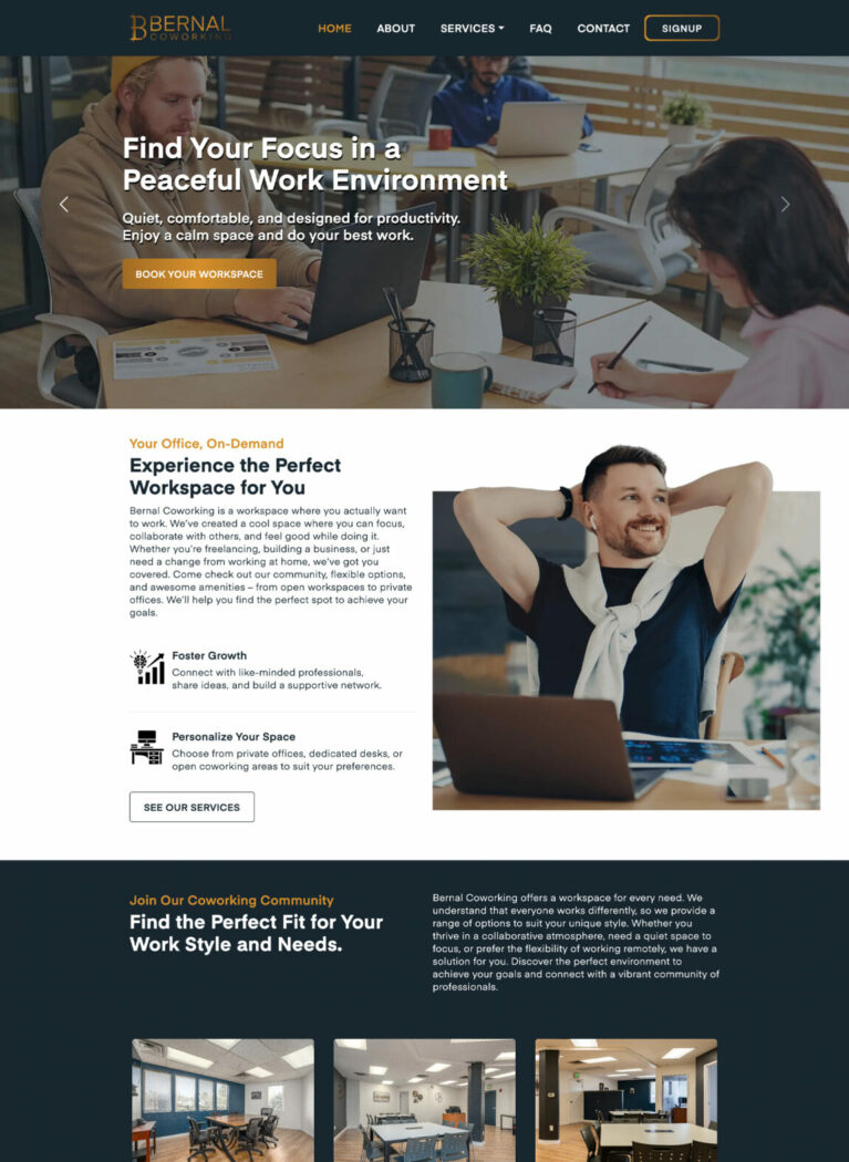
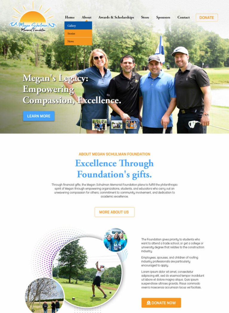
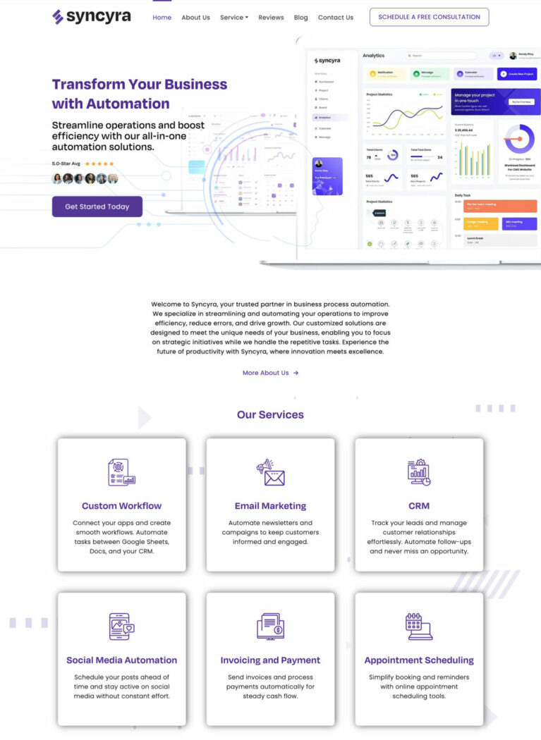
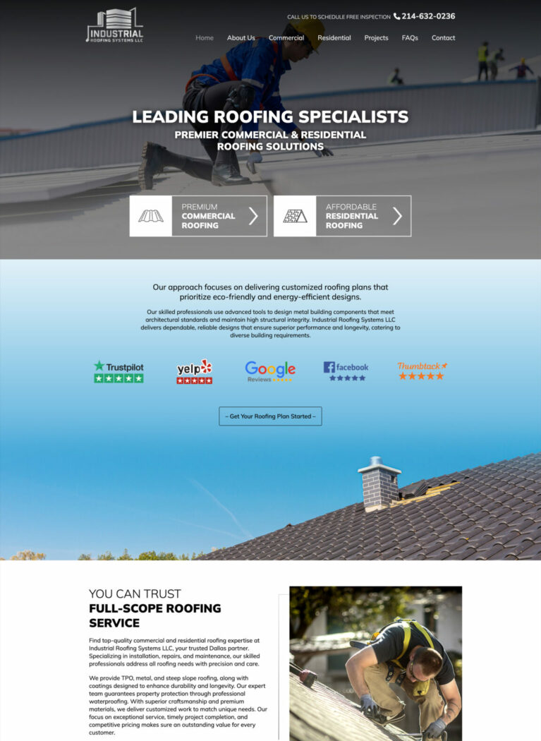
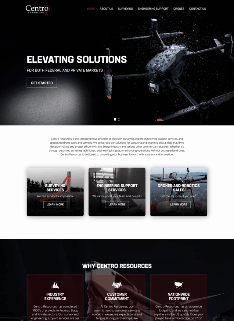
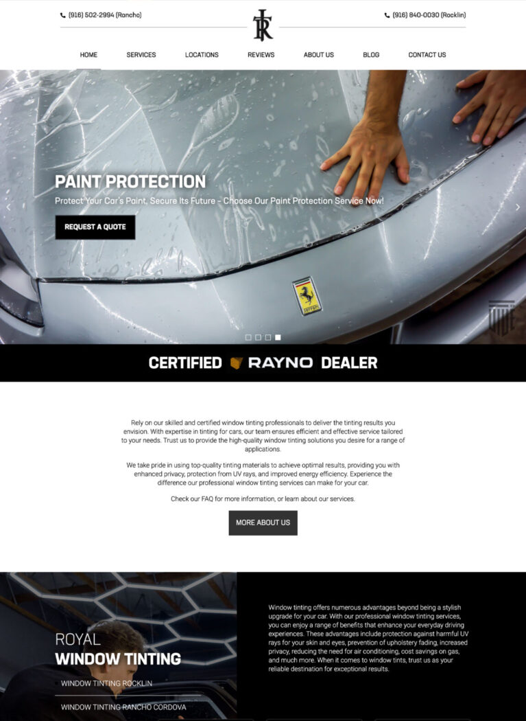
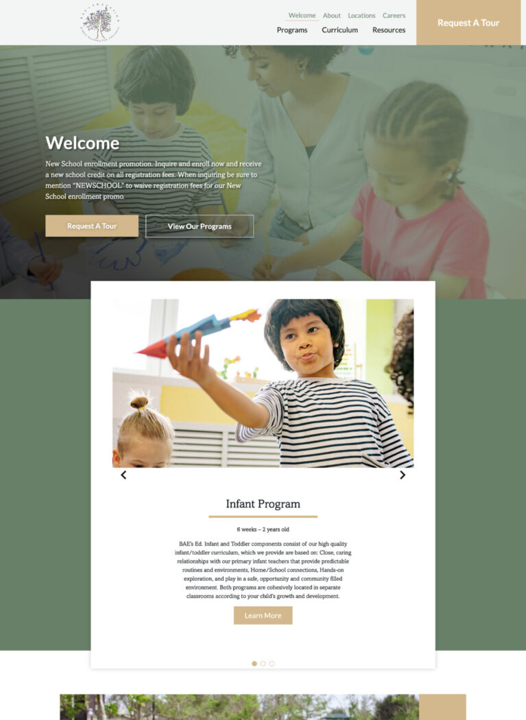
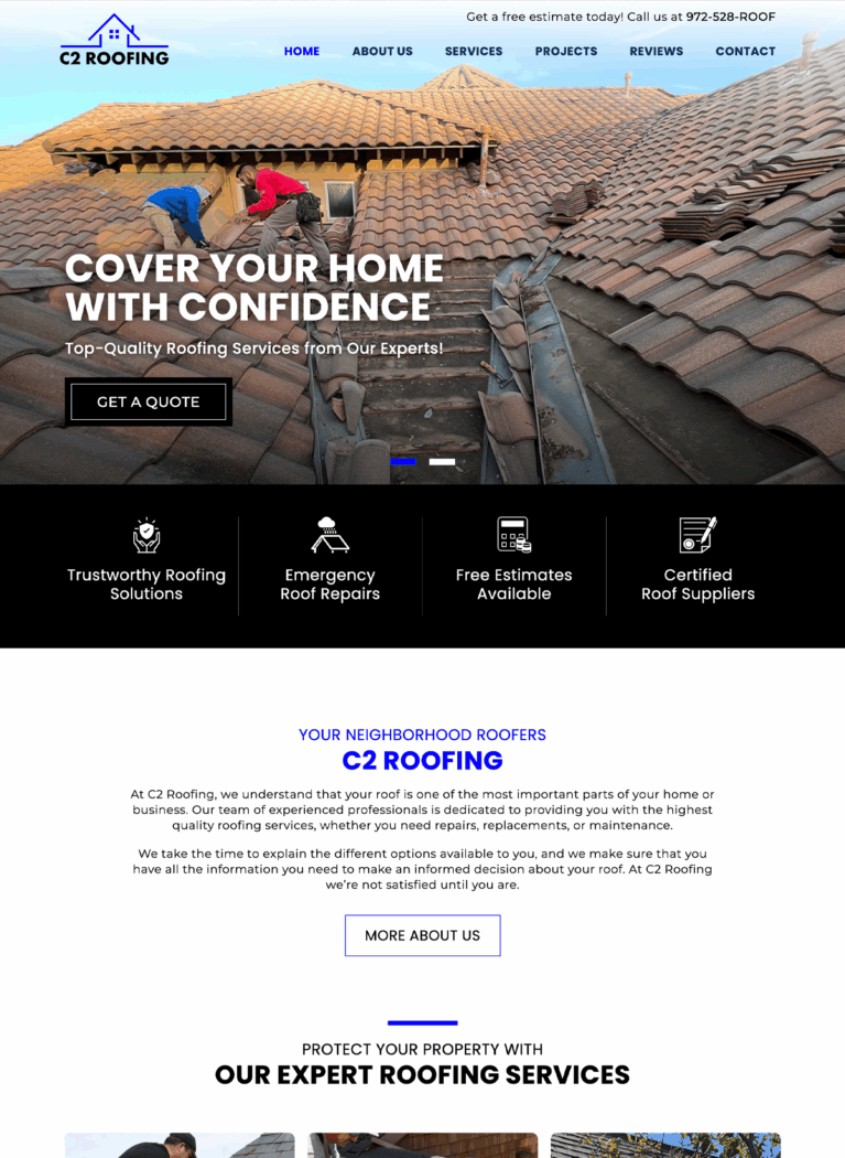
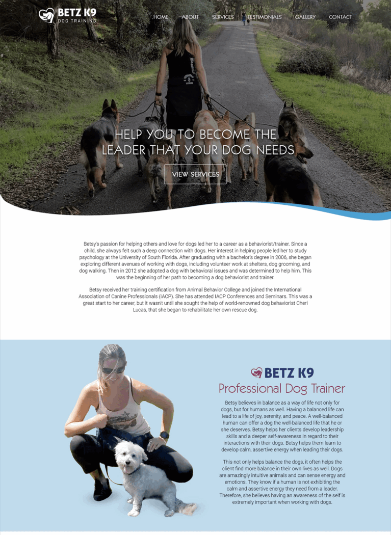
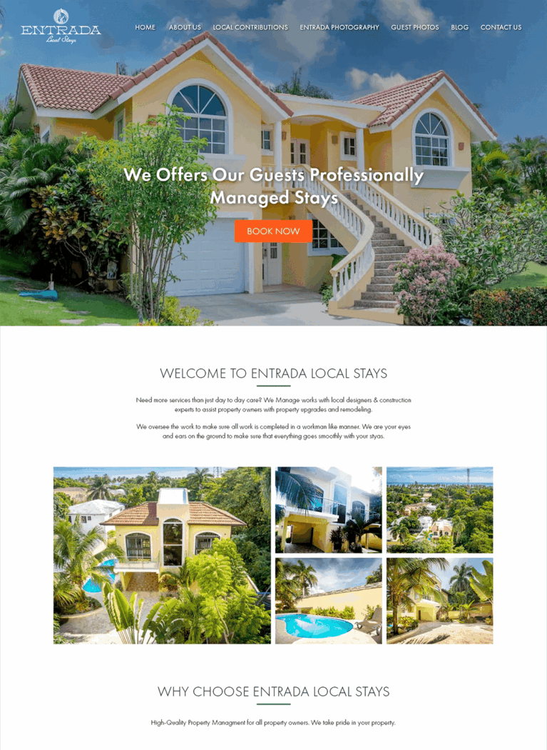
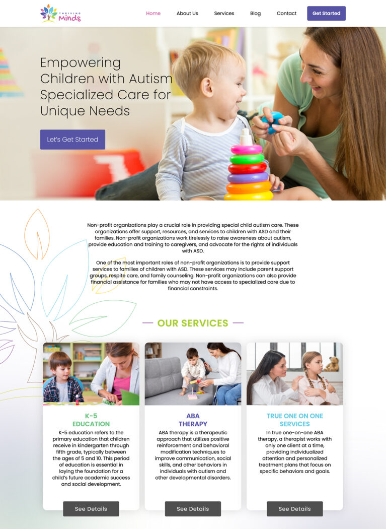
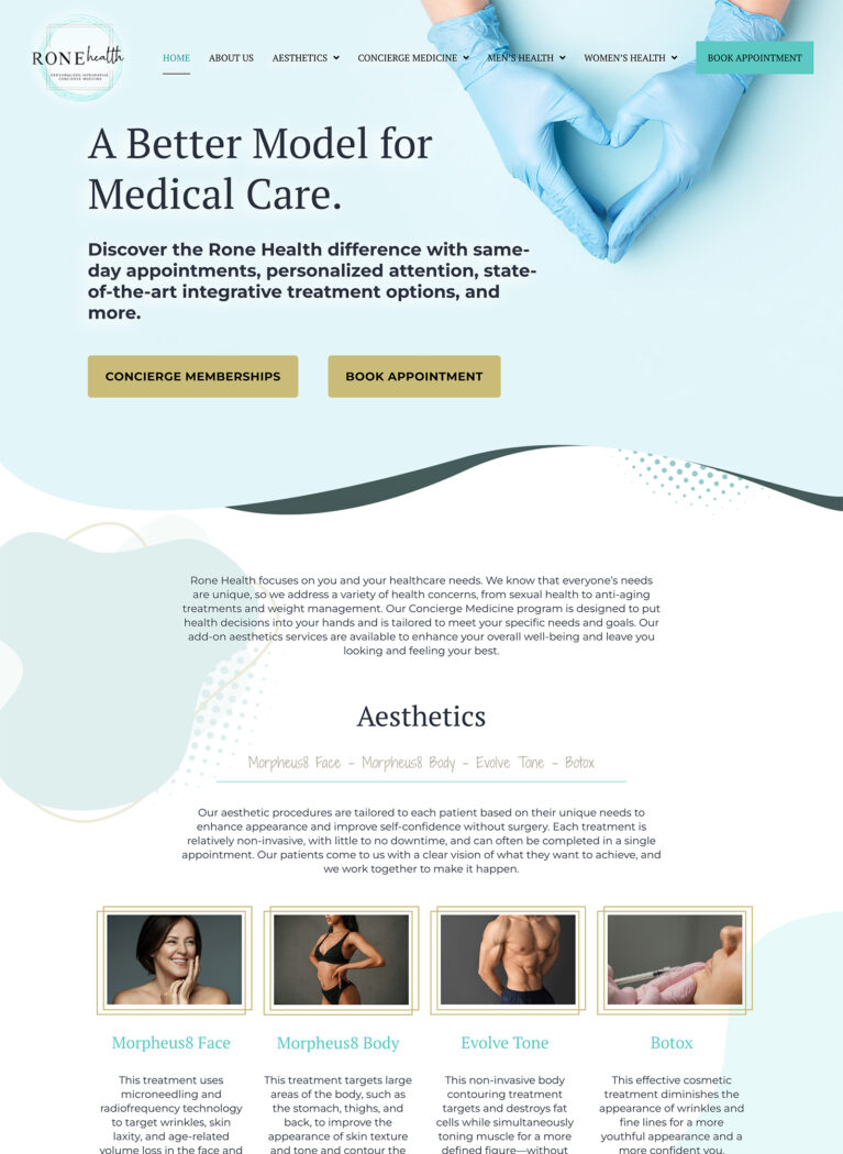
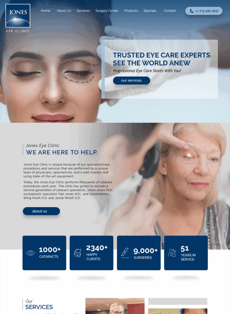
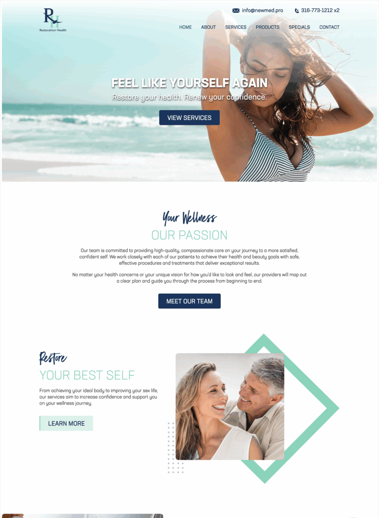
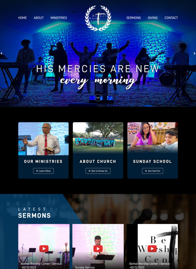
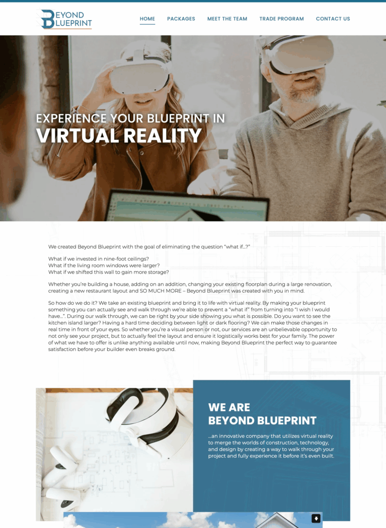
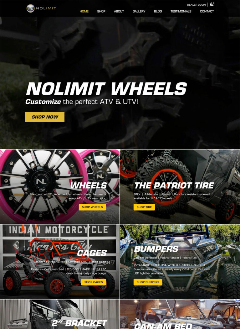
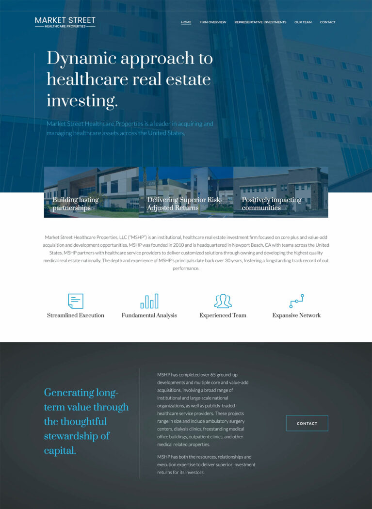
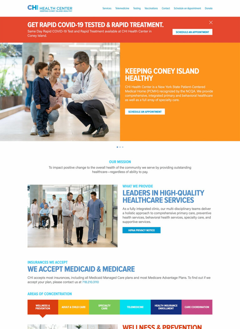
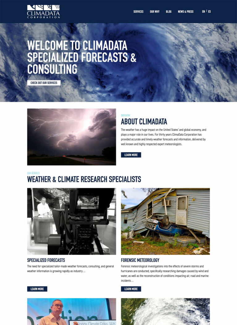
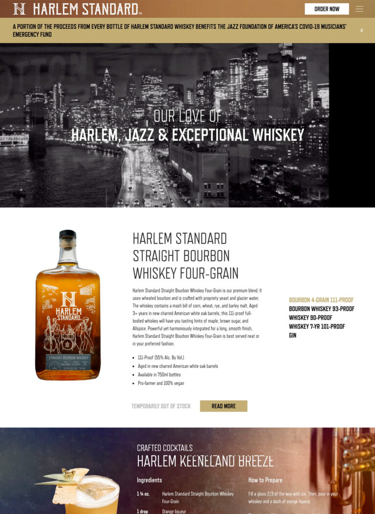
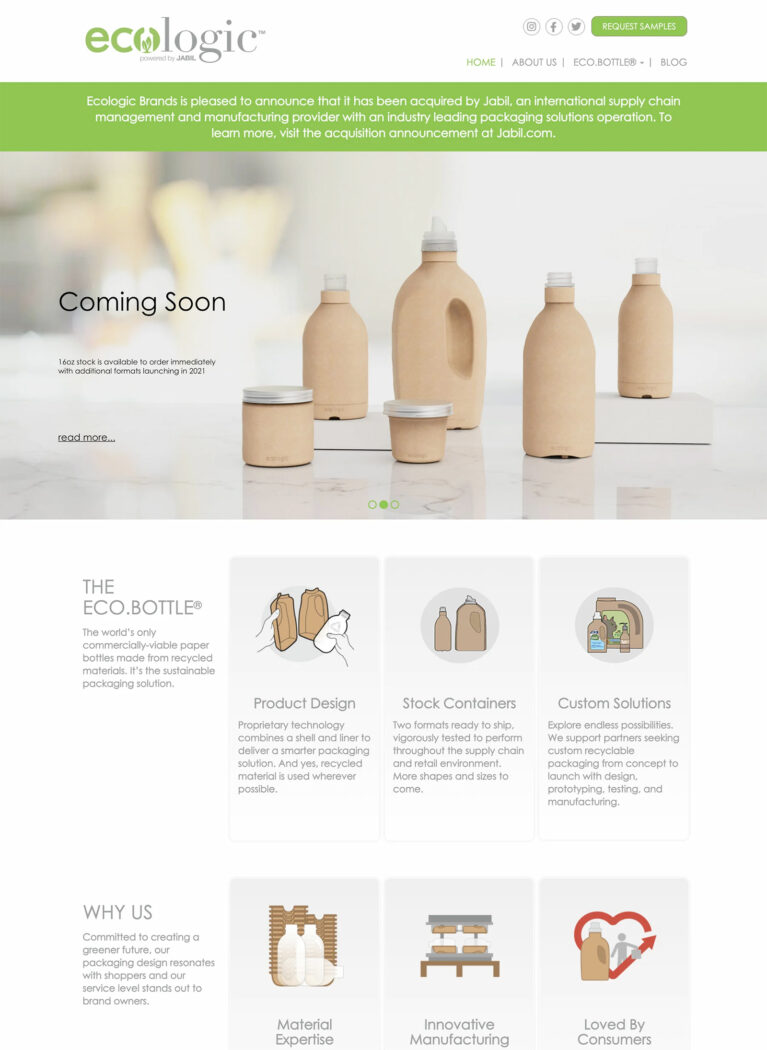
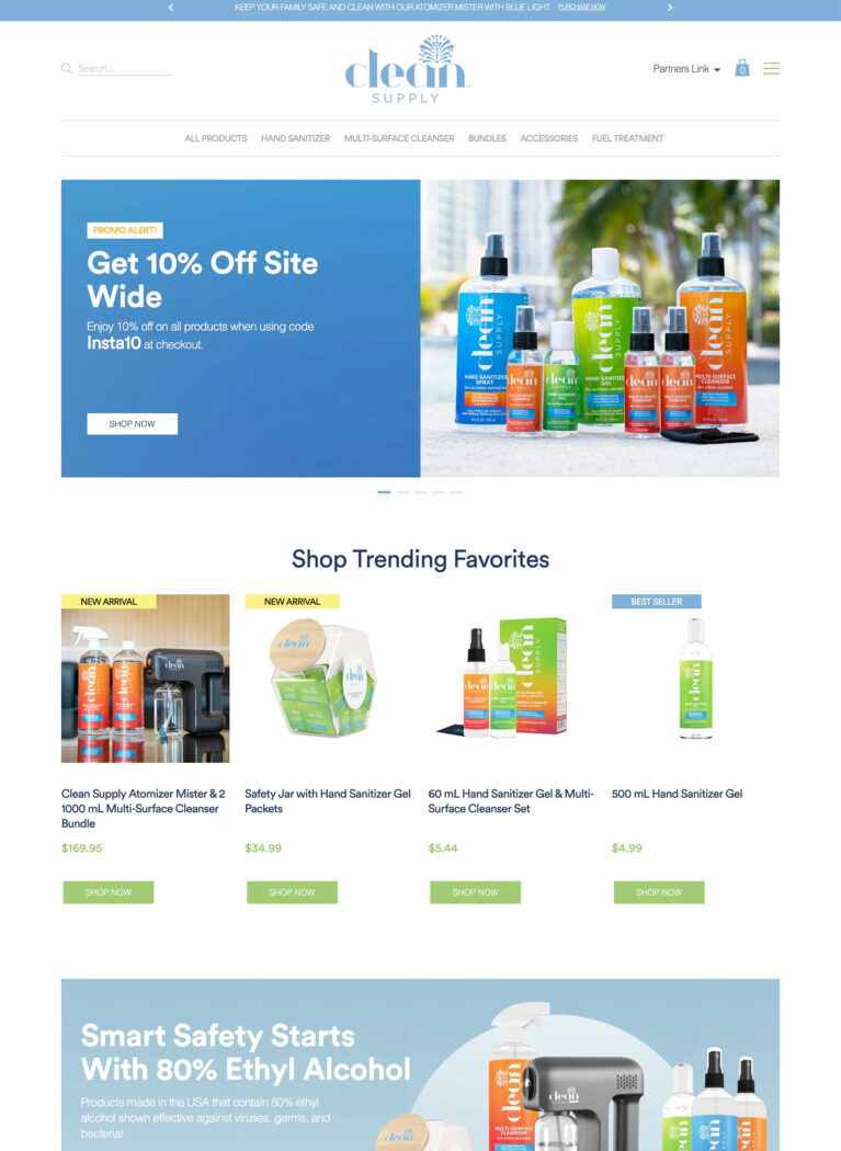
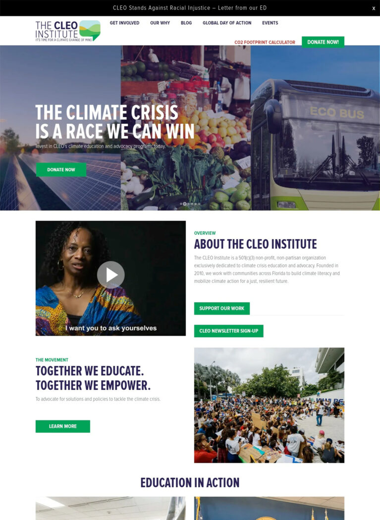
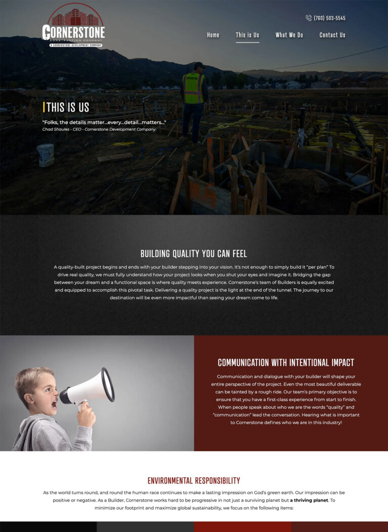
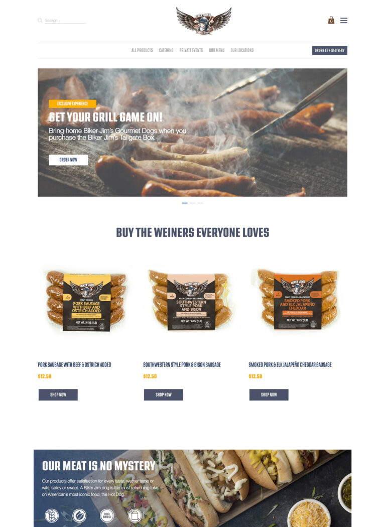
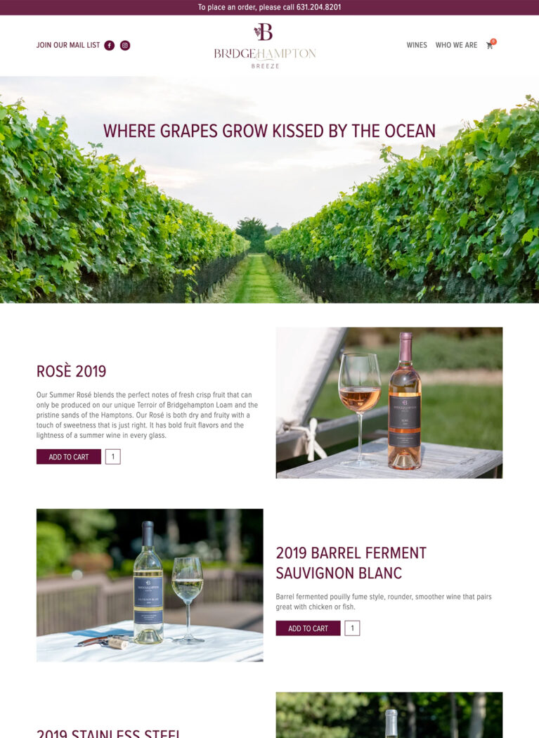
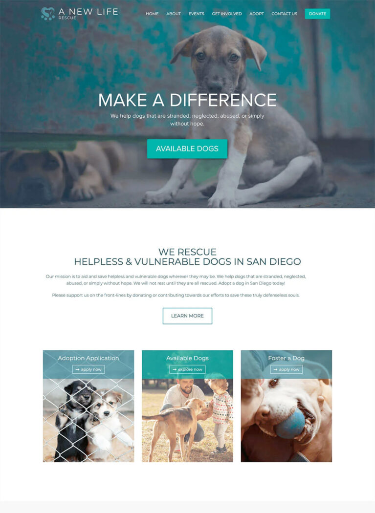
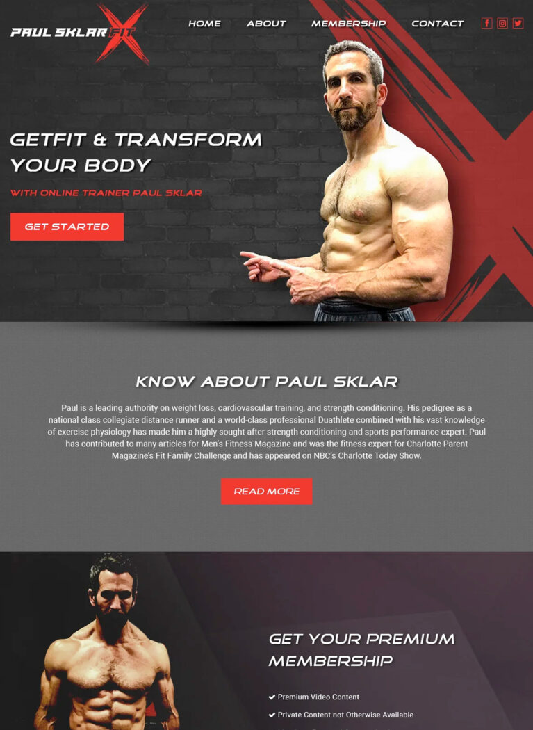
The Showcase
Dallas Web Design
Dallas Web Design has an excellent and successful record of helping companies, businesses, startups, and brands to plan, create, implement, and support critical software applications. Our portfolio affirms our proficiency as a Dallas Web Design agency to provide high-quality software development services in Dallas, the US, and around the world.


Boosted Rankings with Mobile Optimization
Benefits of Responsive Web Design
Responsive web design offers numerous benefits that can significantly impact your business’s growth and online presence. For businesses in Dallas, where mobile usage is high, responsive web design is even more critical to ensure you’re reaching your target audience effectively.
Here are some of the key benefits of responsive web design for businesses in Dallas:
Increased Mobile Traffic
With more and more people accessing the internet on their smartphones, having a mobile-friendly website is essential for attracting and retaining mobile visitors. Responsive web design leadS to increased mobile traffic and engagement. This is particularly important for businesses in Dallas, where a significant portion of online traffic comes from mobile devices.
Improved User Experience (UX)
A positive user experience is crucial for keeping visitors on your website and encouraging them to explore your content. Responsive web design ensures that your website is easy to navigate, read, and interact with on any device, leading to a better overall experience for your users. A seamless user experience can lead to increased engagement, lower bounce rates, and higher conversion rates.
Better SEO
Search engines, like Google, prioritize mobile-friendly websites in their search results. By investing in responsive web design, you can improve your website’s SEO and increase its visibility in search rankings, leading to more organic traffic and potential customers finding your business online. Responsive web design is a key factor in achieving high search engine rankings and improving your website’s visibility in Dallas.
Higher Conversion Rates
A user-friendly website that provides a positive experience across all devices can lead to higher conversion rates. Whether you want visitors to make a purchase, fill out a contact form, or sign up for your newsletter, responsive web design can help you achieve your goals by making it easier for users to interact with your website and take action.
Enhanced Brand Consistency
A responsive website ensures that your brand identity remains consistent across all devices. This helps to build trust and credibility with your audience, as they will have a cohesive experience with your brand regardless of how they access your website.
Cost-Effectiveness
While there is an initial investment involved in responsive web design, it can ultimately save you money in the long run. By having a single website that adapts to all devices, you eliminate the need to create and maintain separate mobile and desktop versions, reducing development and maintenance costs. This is particularly beneficial for small businesses in Dallas that are looking for affordable responsive web design solutions.
Improved Website Maintenance
With a responsive website, you only need to manage one set of content, making website maintenance easier and more efficient. This saves you time and resources, allowing you to focus on other aspects of your business.
Want to reach more customers on mobile and desktop? Discover how responsive design can help you stay competitive and enhance your website’s performance.
3X leads and 200% increase in sales!
Jacob Stabler
ATV Wholesale Outlet

Prioritizing Accessibility for All Users
Responsive Web Design Best Practices
Creating a truly effective responsive website requires a strategic approach that prioritizes user experience (UX), SEO, and performance across all devices. Here are some responsive web design best practices to keep in mind:
Prioritize Mobile-First Design
With the majority of web traffic now coming from mobile devices, it’s essential to adopt a mobile-first design approach. This means starting your web design process by focusing on the smallest screen size and then progressively enhancing the design for larger screens.
This ensures that your website is optimized for mobile users first and foremost, providing a seamless experience on all devices. By prioritizing mobile optimization, you can create a website that caters to the growing number of mobile users in Dallas.
Optimize Page Speed
Page speed is a critical factor for both user experience and SEO. Slow-loading websites can frustrate visitors and lead to higher bounce rates. Optimize your website’s images, code, and resources to ensure fast loading times across all devices.
Tools like Google PageSpeed Insights can help you identify areas for improvement. A fast-loading website not only provides a better user experience but also improves your website’s ranking in search results.
Ensure Cross-Browser Compatibility
Your website should look and function correctly across all major web browsers (Chrome, Firefox, Safari, Edge). Use cross-browser compatibility testing tools to identify and resolve any inconsistencies in how your website is displayed. This ensures that all visitors, regardless of their browser preference, have a positive experience on your website.
Use a Fluid Grid
A fluid grid is a key component of responsive web design. It allows your website’s layout to adjust dynamically to different screen sizes, ensuring that elements are properly proportioned and aligned regardless of the device being used. This is essential for creating a responsive website that adapts seamlessly to any screen size.
Optimize Images
Images can significantly impact your website’s loading speed. Use optimized images in formats like WebP that are compressed for web use. Ensure your images are responsive by using the <picture> element or srcset attribute in your image tags. Properly optimized images not only improve page speed but also contribute to a better user experience.
Use Media Queries
Media queries are a powerful tool in responsive web design. They allow you to apply different CSS styles based on specific device characteristics, such as screen size, resolution, and orientation. This enables you to fine-tune your website’s layout and appearance for different devices, ensuring a consistent experience across all platforms.
Prioritize Content
When designing for smaller screens, prioritize the most important content and features. Use a clear and concise content hierarchy to guide users through your website and ensure they can easily find what they’re looking for. This improves user experience and makes it easier for visitors to access the information they need on any device.
Test Thoroughly
Thorough testing is essential to ensure your responsive website functions correctly across all devices. Use a combination of real devices and browser emulators to test your website on different screen sizes, resolutions, and operating systems. This helps identify and resolve any potential issues before your website goes live, ensuring a seamless experience for all visitors.
Need help implementing these best practices for your Dallas business? Contact Bless Web Designs today. Our expert team can help you create a responsive website that delivers a seamless and engaging experience for your audience on any device.
Serving Dallas Businesses Across Industries
WordPress is a versatile platform that can be adapted to meet the unique needs of businesses across various industries. At Bless Web Designs, we have extensive experience creating custom WordPress websites for a diverse range of clients in Dallas. Here’s how we leverage the power of WordPress to help businesses in different sectors achieve their online goals:

Healthcare Web Design
For healthcare providers in Dallas, such as hospitals, clinics, and private practices, we create WordPress websites that prioritize patient experience and accessibility. We integrate features like online appointment scheduling, patient portals, and resources for health information.

Technology Web Design
Tech companies in Dallas need websites that are innovative, cutting-edge, and showcase their expertise. We leverage WordPress to build dynamic and interactive websites that highlight their products, services, and thought leadership in the tech industry.

Real Estate Web Design
In the Dallas real estate market, a visually stunning and user-friendly website is essential. We create WordPress websites for real estate agents and agencies that showcase property listings, virtual tours, and client testimonials, helping them attract buyers and sellers.

Hospitality Web Design
For restaurants, hotels, and other hospitality businesses in Dallas, we create WordPress websites that capture the essence of their brand and provide a seamless online experience for their guests. We integrate features like online booking, menus, and event calendars.

Education Web Design
Educational institutions in Dallas, from schools and universities to online learning platforms, require websites that are informative, engaging, and accessible to students, faculty, and parents. We leverage WordPress to build user-friendly websites with features like online courses, student portals, and event calendars.

Non-profits Web Design
We understand the unique needs of non-profit organizations in Dallas. We create WordPress websites that effectively communicate their mission, showcase their impact, and facilitate online donations and volunteer engagement.
5X Boost in Online Sales!
Charlotte Smith
Colibri Group
Modern and Unique Designs!
Tyler N
Dallas, TX

Responsive Web Design for Different Industries
Tailored Solutions for E-Commerce Business
While responsive web design is beneficial for all businesses, its applications and advantages can vary across different industries. With Dallas businesses ranging from healthcare to technology, it’s essential to personalize your website design to meet the specific needs and expectations of your target audience.
Here’s how responsive web design can be tailored to the unique needs of various sectors in Dallas:
Healthcare
In the healthcare industry, providing a seamless and accessible online experience is crucial. Patients often use their mobile devices to search for healthcare providers, book appointments, and access medical information.
A responsive website ensures that your patients can find the information they need, and connect with your practice regardless of the device they are using. This is particularly important for healthcare providers in Dallas, where patients are increasingly relying on their mobile devices to access healthcare information and services.
Example: A Dallas-based hospital with a responsive website can allow patients to easily access information about their services, find doctors, schedule appointments online, and access patient portals from their smartphones. This improves user experience (UX), increases patient engagement, and strengthens the hospital’s online presence.
Restaurants
For restaurants, a mobile-friendly website is essential for attracting diners and driving reservations. Customers often use their phones to search for restaurants near them, browse menus, and place online orders. With the rise of food delivery apps and online ordering, having a responsive website is crucial for restaurants in Dallas to remain competitive and cater to the needs of their customers.
Example: A trendy restaurant in Uptown Dallas can use a responsive website to show off its menu with compelling images, allow customers to make reservations online, and provide directions and contact information for easy access. This can lead to increased online reservations, improved customer satisfaction, and a boost in revenue.
Retail
In the retail industry, where online shopping is increasingly popular, a responsive website is crucial for driving sales and providing a positive customer experience. Shoppers expect a seamless experience across all devices, whether they are browsing products, comparing prices, or making purchases.
A responsive website ensures that your online store is user-friendly, your product images are displayed correctly, and your checkout process is optimized for conversions on any device.
For retail businesses in Dallas, a responsive website can be a powerful tool for reaching a wider audience, increasing brand awareness, and driving sales, especially with the growing trend of mobile commerce.
Example: A clothing boutique in Deep Ellum can use a responsive website to display its latest collections with high-quality images, allow customers to browse and purchase items seamlessly on their phones, and offer promotions and discounts to mobile shoppers. This can lead to increased online sales, improved customer loyalty, and a stronger brand presence.
Legal
Law firms and legal professionals in Dallas need to establish trust and credibility with their online presence. A responsive website can help achieve this by providing a professional and user-friendly experience for potential clients seeking legal assistance.
A responsive website ensures that potential clients can easily access information about your firm and services, regardless of the device they are using. Easy access to information about practice areas, attorney profiles, and contact details is crucial for converting website visitors into clients.
Example: A Dallas law firm specializing in personal injury can use a responsive website to provide detailed information about their services, show their attorneys’ expertise, and offer a convenient way for potential clients to schedule consultations online. This can help the firm attract new clients, build trust, and establish itself as authoritative in the Dallas legal community.
Other Industries
The benefits of responsive web design extend to numerous other industries in Dallas, including:
Education
Schools and universities can use responsive websites to provide students with easy access to information about courses, programs, faculty, and campus resources. A mobile-friendly website is especially important for educational institutions to engage with prospective and current students who frequently use their smartphones and tablets to access information.
Nonprofits
Nonprofit organizations can leverage responsive web design to reach a wider audience, promote their cause, and facilitate online donations. A responsive website makes it easy for supporters to learn about your mission, donate to your cause, and get involved from any device.
Technology
Tech companies in Dallas can use responsive websites to showcase their innovative products and services, attract investors, and engage with their tech-savvy audience. A cutting-edge responsive website reflects the innovative nature of the tech industry and provides a seamless experience for users across all devices.
Looking for a way to improve your website’s performance across devices? Let’s optimize your design for maximum impact.
Essential Information for Modern Websites
Responsive Web Design FAQs for Business Owners
What is responsive web design?
Responsive web design is an approach to website design that ensures your website provides an optimal viewing experience for users regardless of their screen size. This means your website will look and function flawlessly on desktops, laptops, tablets, and smartphones.
Why is responsive web design important for my Dallas business?
More and more people are using their smartphones to access the internet. A responsive website ensures that your Dallas customers have a positive experience on your website, regardless of the device they are using. This can lead to increased engagement, lower bounce rates, and higher conversion rates.
What are the benefits of responsive web design?
Responsive web design offers numerous benefits, including improved user experience (UX), increased mobile traffic, better SEO, higher conversion rates, enhanced brand consistency, and cost-effectiveness.
How much does responsive web design cost?
The responsive web design cost varies depending on the complexity of your website and the specific features you require. Contact us today for a free quote and to discuss your responsive web design needs.
How long does it take to create a responsive website?
The timeline for creating a responsive website can vary depending on the scope of the project. However, most projects can be completed within a few weeks to a few months.
Can you provide some responsive web design examples?
Yes, we have a portfolio of responsive web design examples that showcase our work. You can view our portfolio on our website or contact us to discuss specific examples.
How do I know if my website is responsive?
You can use a responsive web design testing tool to check if your website is responsive. These tools simulate different screen sizes and devices, allowing you to see how your website looks and functions on various platforms.

Improve User Experience and Retention
Why Your Dallas Business Needs a Mobile-Optimized Website
A responsive website ensures that your Dallas business can reach its full online potential by providing a consistent and user-friendly experience for all visitors, regardless of how they access your site. This not only improves user experience (UX) but also boosts your SEO and drives conversions, leading to more leads, sales, and brand loyalty.
Nowadays, having a mobile-optimized website is crucial, as a significant portion of local searches are conducted on smartphones and tablets. Moreover, a responsive design adapts seamlessly to various screen sizes and devices, reducing the likelihood of visitors encountering usability issues that could deter them from engaging with your content.
Investing in a mobile-optimized website also demonstrates your commitment to accessibility and user satisfaction, which can enhance your brand reputation and differentiate you from competitors in the Dallas market.
Expert Responsive Web Design for Your Dallas Business
Bless Web Designs is a trusted responsive web design company in Dallas, specializing in creating websites that adapt seamlessly across devices while meeting the specific needs of businesses of all sizes. Our team of skilled designers and developers focuses on building responsive websites that are visually impressive, highly functional, and geared toward delivering tangible outcomes for your business.
By choosing Bless Web Designs as your Dallas web design company, you’ll benefit from:
- Decades of experience in creating high-performing, mobile-friendly websites.
- A collaborative approach that puts your needs first.
- SEO expertise to help you rank higher in search results and attract more organic traffic.
- Responsive design that ensures your website functions seamlessly on all devices.
- User-friendly Content Management Systems (CMS), like WordPress, that help you to manage your website content with ease.
- Ongoing website maintenance and support to keep your website secure, up-to-date, and performing at its best.
We are dedicated to supporting your Dallas business with responsive web design solutions addressing your unique goals and challenges. Reach out to the top web designers in Dallas today to discuss your requirements and discover how we can help you build a website that drives success online!