When it comes to website design, the user interface is one of the most important aspects to consider. After all, if the user can’t easily navigate your website, they’re not likely to stick around for long. So what are the best techniques for creating a user-friendly interface?
A quality user interface is intuitive and easy to use. It’s designed in such a way that the user can easily figure out how to use it without having to read a manual or watch a tutorial. User interface should be visually appealing. It should be designed to be visually appealing and engaging, so that the user will want to use it. A quality user interface should be responsive. It should respond quickly and accurately to the user’s input so that they can interact with it smoothly and efficiently.
Simplicity
When it comes to the user interface, simplicity is key. The easier it is for users to navigate your site or app, the more likely they are to stick around and use it. In order to achieve simplicity in your user interface, you need to focus on making everything as easy to use as possible.
One way to do this is by using clear and concise labels. If you have buttons or icons, make sure the text next to them clearly describes what they do. You also want to avoid using too many controls at once. Too many options can be overwhelming for users and can lead to confusion.
Another way to simplify your user interface is by using standard designs and layouts. This will help users familiar with other sites or apps navigate your site easily. And finally, always test your designs with actual users to get their feedback. User feedback is essential in creating a simple and effective user interface.

You want your users to be able to understand and use your app or website with ease. Here are a few tips to help you achieve simplicity in your user interface:
a. Keep your design clean and organized. Make sure all of your buttons and icons are easy to see and click on, and that your text is easy to read.
b. Use common patterns and conventions. This will help your users learn how to use your app or website quickly.
c. Keep it simple. Don’t try to pack too much information into one screen or page. Break things down into manageable chunks, and make it easy for users to navigate your app or website.
d. Use feedback wisely. Make sure your users know what actions they are taking and what the results of their actions will be.
e. Test, test, test! Make sure you get feedback from real users during the testing phase of your project. This will help you fine-tune your user interface and make sure it is as simple as possible.
Clarity
The clarity in user interface is crucial for a positive user experience. When designing your interface, be sure to use clear and concise language. Avoid jargon and complex terminology. Use simple, everyday words to communicate with your users.
Also, make sure your design is easy to understand. Use standard controls and layouts that users are familiar with. Don’t confuse them with unfamiliar or unexpected elements. Make sure everything is clearly labeled and easy to find.
A clear and concise user interface will help ensure a positive user experience for your app or website. If your users can’t understand what they’re seeing or doing, they won’t stick around for long. This is especially true for new users, who may not be familiar with your product or how it works.
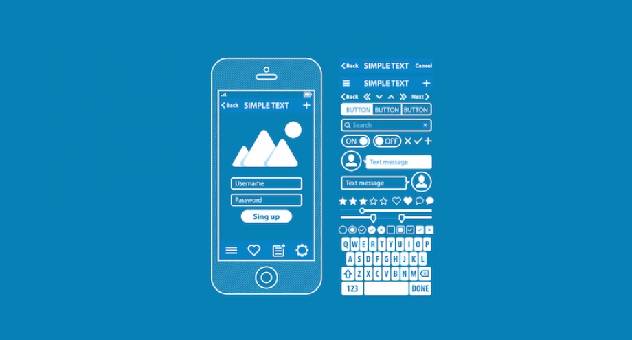
Here are a few tips to help you improve the clarity of your user interface:
a. Use clear labels and descriptions.
Make sure all of your buttons and icons are labeled clearly, and use concise, easy-to-read text throughout your interface. Don’t make your users guess what you want them to do – tell them outright.
b. Use standard controls and navigation.
Most users are familiar with the standard controls and navigation used in most applications. If you stray from these conventions, you may confuse your users and make it difficult for them to navigate your product.
c. Keep your design simple.
Avoid using too many colors or graphics in your interface – these can be distracting and make it difficult for users to focus on what they need to do. Keep your design simple and streamlined, and focus on creating an intuitive user experience.
Consistency
User interface consistency is key when it comes to providing a positive user experience. When users know what to expect in terms of how your app or website will look and behave, they are more likely to feel comfortable using it. If different elements of your user interface look and behave differently, users will become confused and frustrated. This can lead to them not being able to find the information they need or complete tasks successfully.
A consistent user interface also makes it easier for users to learn how to use your app or website. By following common design patterns and sticking to a standard layout, website designers can ensure that website our users will be able to navigate the app or website with ease.
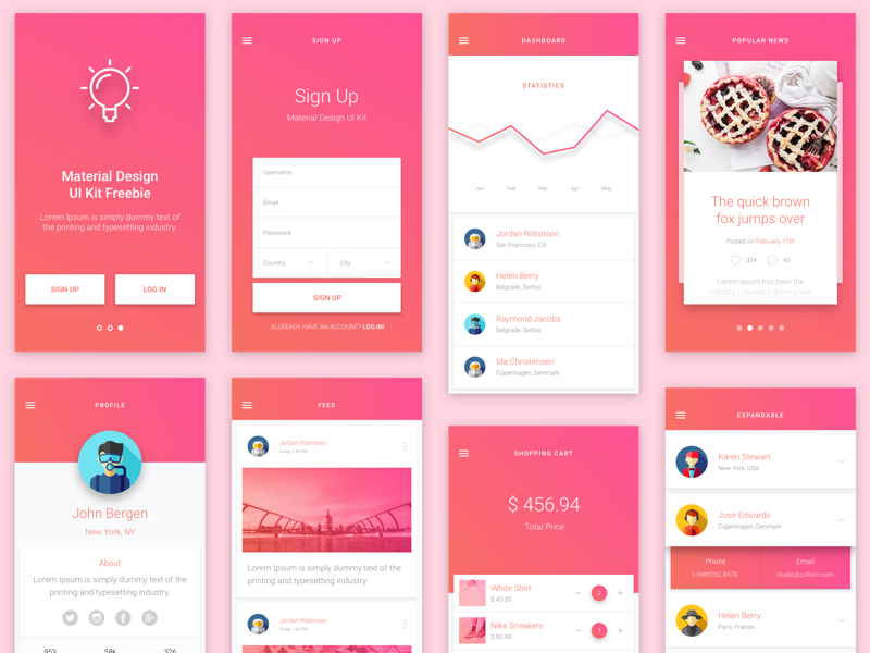
There are a few things to keep in mind when creating a consistent user interface:
a. Use common design patterns.
When designing your app or website, make sure to use common design patterns. Use the same design principles across all screens and elements. This will help make your app or website easy to learn and use.
b. Stick to a standard layout.
It’s important to have a standard layout for your app or website. This will help users feel comfortable using your app or website, and they will be able to find the information they need quickly and easily. Use common controls and icons throughout your user interface, which will help users become familiar with how your app or website works.
c. Be consistent with your terminology.
Be consistent with the terminology you use throughout your app or website. This will help users understand what you’re saying, and it will make it easier for them to find what they’re looking for. Make sure all text is easy to read and visually consistent. Use the same fonts, sizes, and colors for all text elements to create a cohesive look.
Familiarity
You probably don’t think too much about the user interface (UI) of the websites you visit every day. You may not even give it a second thought. But the UI of a website is actually extremely important. In fact, familiarity is one of the most important factors in designing a good UI.
When users are familiar with the way a website looks and works, they’re more likely to be comfortable using it. This means they’re more likely to complete tasks on the website, such as making a purchase or signing up for a service. In fact, studies have shown that familiarity is so important that users are more likely to return to a website if they’re familiar with its UI.
So if you want to design an optimal website, make sure you focus on creating a UI that’s familiar to your users. This will make them more comfortable using your website and increase the chances that they’ll stick around and complete the tasks you want them to do. Making a familiar user interface is all about making your users feel comfortable. You want them to feel like they can use your product without any trouble, and that they understand how it works right from the start.
There are a few things you can do to make your user interface more familiar:
a) Use common design patterns.
b) Use standard terminology.
c) Make sure everything is easy to find.
d) Use familiar icons and graphics.
e) Keep the layout simple.
f) Test your user interface with real users.
Making a familiar user interface doesn’t have to be difficult – just follow these tips and you’ll be on your way!
Visual Hierarchy
When it comes to user interface design, visual hierarchy is key. This means that you need to think about the order in which users will see elements on the screen and how they will interact with them.
One of the most important things to consider is how different elements are visually related to each other. You want to make sure that the most important items are easy to see and that users can understand how to interact with them.
One way to make a visual hierarchy is to use different levels of importance to denote different elements on your screen. The most important elements should be at the top of the screen, while the less important elements can be placed lower down. This will help users focus on the most important information and interactions, while still allowing them to see all of the relevant information.
Another way to create a visual hierarchy is by using different colors and sizes to denote different levels of importance. For example, you could make the most important elements blue and larger than the other elements, while making the less important elements yellow and smaller. This will also help users focus on the most important information.
No matter how you choose to denote different levels of importance in your user interface, it is important to make sure that everything is clearly labeled and easy to understand. This will ensure that users are able to interact with your design effectively and efficiently.
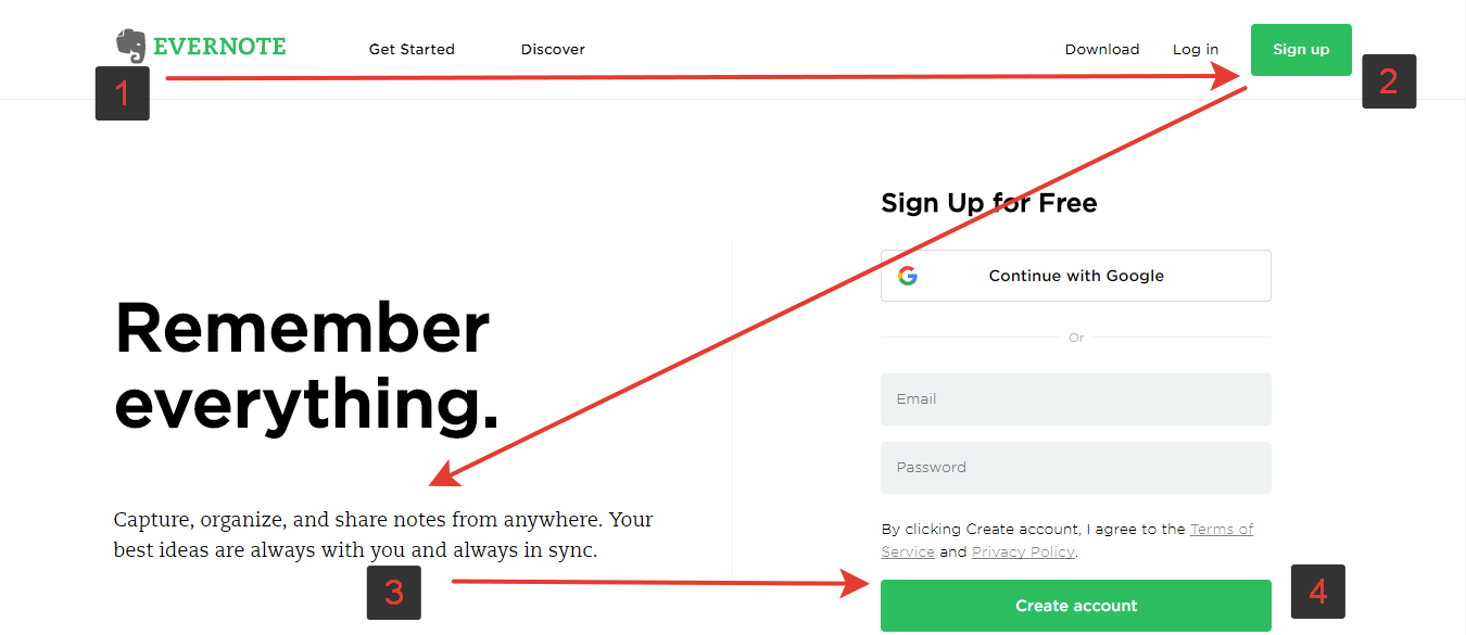
Size is often one of the most important factors in creating a visual hierarchy. Larger items will naturally be given more attention than smaller items. You can use this to your advantage by making sure the most important items are larger than everything else on the screen.
Color can also be used to create a visual hierarchy. Different colors can be used to highlight different elements or groups of elements. This can help users understand where they should focus their attention.
The position is another important factor in creating a visual hierarchy. Items that are closer to the top or left of the screen will be given more attention than those that are further down or on the right side. You can use this to place important items at the top of the screen or near the left edge.
Finally, typography can also be used to create a visual hierarchy. Different fonts and font sizes can be used to highlight different pieces of information. This can help users scan through long lists or pages of information quickly and easily find what they’re looking for.
Efficiency
A user interface is only efficient if it is designed with the user in mind. When you are designing your interface, take the time to consider what users will want to do and make sure those activities are easy and quick to perform. You can improve the efficiency of your interface by streamlining the process and making each step as quick and easy as possible.
When designing your interface, it is important to keep the user in mind. Make sure each step is quick and easy to perform, so users can navigate through your content with ease. Consider what activities users are likely to want to do and make sure those tasks are easy to accomplish. By taking these steps, you can create an efficient user interface that will allow users to interact with your content quickly and easily.
When it comes to improving the efficiency of your user interface, task analysis is key. By considering the activities and tasks users are most likely to perform, you can streamline the process to make each as quick and easy as possible. This means designing an interface that is easy to navigate and provides users with all the tools they need to complete their tasks quickly and easily.
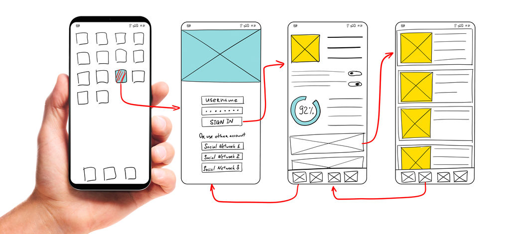
UI development. Male hand holding smartphone with wireframed user interface screen prototypes of a mobile application on white background.
One way to achieve this is by keeping your design simple and streamlined. When everything is neatly organized and easy to find, users can focus on completing their tasks rather than trying to figure out how to use your interface. Additionally, make sure all buttons and icons are clearly labeled so users don’t have to waste time trying to determine what each one does.
Another way to improve efficiency is by testing your interface with real users. By watching how they interact with your design and listening to their feedback, you can identify areas where you can make improvements. Keep in mind that no design is perfect, so be prepared to make changes based on user feedback.
In the end, creating an efficient user interface requires a lot of hard work and careful consideration, but it’s worth it when you see how smoothly it operates. So take the time to analyze your users’ tasks and create a design that makes completing them as easy as possible.
Responsiveness
In order to provide the best user experience, your interface needs to be both fast and responsive. Users become frustrated quickly when they have to wait for a website to load, for instance. And according to Kissmetrics, 40% of people will abandon a website that takes more than 3 seconds to load.
Mobile apps and websites that load and operate quickly improve the user experience. Additionally, responsiveness should also take into account how well an interface responds to user input. Your interface should be easy to use and react quickly to commands or clicks from the user. This improves the overall usability of your product and makes it a more enjoyable experience for the customer.

In order to provide a responsive user interface, it is important to consider both the speed and accuracy of your system. Make sure you are using fast-loading pages and streamlined code. Test your system regularly to make sure any bugs or glitches are fixed quickly. And always be prepared to adjust on the fly as users’ needs change. By following these guidelines, you can create a responsive user interface that will keep your customers coming back for more.
One important way to make your interface more responsive is to improve your code. This means taking measures to make sure your code is efficient and well organized. You can also improve responsiveness by caching data. This will help keep the user interface smooth and fast. Finally, you can optimize images and other elements on the page to help keep loading times down. All of these measures will help improve the overall responsiveness of your interface.


