


Home / Functional Web Design / Mobile-First Design / Mobile-First Design: Why Your Website Must Look Great on a Phone in Dallas
 Written by
 Key Takeaways
- Google’s search engines use a smartphone crawler to index websites, meaning a site that works poorly on mobile can become invisible in search results.
- The quick population growth in the Dallas area means a continuous number of new residents use their phones to find local businesses for the first time.
- Local searches from mobile devices are very effective, with 88% of users calling or visiting a business within 24 hours and 78% of those searches leading to a purchase.
- A mobile-first design is a strategy that begins with the small screen to focus on essential content, which creates a better user experience than older approaches.
- A poor mobile experience causes a business to lose customers, while a well-designed responsive website helps generate leads and build trust with clients.
Understanding Mobile-Friendly Websites for Your Business
Many potential customers in Dallas use their phones to find local businesses. A study shows that an important number, 88% of people who search for a local business on their phone, will call or visit that business within 24 hours. A website that is difficult to use on a phone creates a serious problem. Research shows 61% of users are unlikely to return to a mobile site they had trouble using. These people will often find a different company that has a better website for mobile devices.
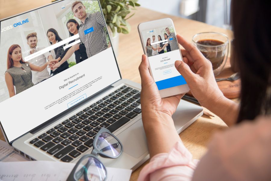
A mobile-first web design is the answer for Dallas businesses. This type of web development focuses on making your website work well on a smartphone from the very start. Bless Web Designs is a design company that offers professional development services to build custom websites. We create a user-friendly site that is easy for every visitor to navigate. A quality mobile website can help your small business succeed.
Why Google Now Requires a Mobile-Friendly Website
A major change from Google affects every business with a website because the company now has new rules for how its search engines find and show websites. After July 5, 2024, Google began to crawl and index all websites using only its Googlebot Smartphone crawler. This important change was the last part of a long process to make the internet better for mobile users and is very important for your search engine optimization. It means that Google’s search engines only look at the mobile version of your website when they decide how to rank it, as a separate desktop version is not used anymore. Your mobile site is the only one that search engines see.

A website with content that cannot be used on a mobile device will be completely excluded from Google’s index, which is a much more serious issue than a simple penalty that just lowers your rank. This complete exclusion means a site that does not work on mobile phones will not appear when people search for it, causing your online visibility to drop completely. This means a Dallas business without a working mobile site could become invisible to potential customers searching for its services online. Having a mobile-friendly website has become a basic requirement for any company wanting to be found online.
What is Responsive Web Design?
Understanding the terms used in web design helps you choose the right development services for your company, because the main goal is to create a website that is easy to use for everyone, especially the large number of mobile users in Dallas. A responsive web design is a very important part of this process because it allows one website to work well on all devices, from small phones to large desktop computers.
What is the Difference Between Mobile First and Mobile Friendly
Many people use these terms, but they describe different approaches to web development. A mobile-first approach is a complete strategy, while a mobile-friendly site is often just a quick fix that is not as effective. Choosing the right method is necessary for the success of your website because it directly affects how easy your site is to use. A positive user experience helps with your search engine optimization and keeps visitors on your page longer. The best custom websites are always built with a clear strategy from the start.
Different Web Design Approaches:
- Mobile-First Design – This is a strategy where the web design process begins with the smallest screen, like a smartphone, to focus on the most important content and functionality.
- Responsive Web Design – This is the technical method that makes a website’s layout change to fit any screen size by using a flexible grid and special CSS code.
- Mobile-Friendly Websites – This is an older approach where a desktop site is simply shrunk down to fit a phone, which can make it slow and hard to navigate.
- The Starting Point – A mobile-first design starts with mobile phones, while the older mobile-friendly method started with a desktop and worked backwards.
- The User Experience – The mobile-first approach creates a faster and more user-friendly experience, while the older method often leads to a poor experience for mobile users.
A Dallas business owner benefits from knowing these differences. You can ask for a website that uses a mobile-first strategy combined with a responsive design. This combination ensures your site is not just viewable on a phone but is truly built for a mobile audience. This leads to a better outcome for both you and your clients. This process avoids the common problems found in older mobile-friendly websites.
How Modern Websites Are Built
The process behind how a website is built affects its performance and how well it works for all visitors. The modern practice for building a site is called progressive enhancement, and it is the foundation of a mobile-first design. This practice is different from the old method of building sites, which was called graceful degradation. One method builds up from a simple foundation, while the other tries to remove parts from a complicated design, which is less effective.
Methods for Building a Website:
- Progressive enhancement is the modern practice – This web design process starts with basic content and features that work on every single device, including older ones.
- Adding features gradually – More advanced design elements and functionality are then added for people using newer browsers and devices with larger screens.
- Focus on accessibility – This method ensures every user can get the most important information, like a phone number or address, no matter their device.
- Graceful degradation is the old practice – This method began with a feature-rich website built for a desktop computer.
- Removing parts of the site – It then tried to remove features to make it work on mobile phones, which often created a slow or broken experience for mobile users.
Using progressive enhancement is the best practice for modern web development. It is the method we use because it results in a website that is fast, reliable, and accessible to the widest possible target audience. This ensures a good experience for every potential customer in Dallas, which helps in building trust with your visitors. It is a more dependable approach to creating a website that serves the needs of your business.
Why a Good Mobile Website is Important in Dallas
While a mobile website is needed everywhere, it is especially important in a quickly expanding and active place like Dallas. The unique combination of population growth, a healthy economy, and a digitally skilled consumer base creates an environment where a superior mobile experience can set a business apart and is a primary cause of local sales.

Dallas’s Growth and Increased Mobile Phone Use
The Dallas-Fort Worth area is one of the fastest-expanding places in the United States, which means a constant number of new people are looking for local services. These new residents frequently use their phones to find everything they need, from restaurants to repair services. A business with a poor mobile website will be invisible to this large and growing group of potential customers.
Facts About the Dallas Area:
- Quick Population Growth – As of 2024, the DFW area’s population was over 8.3 million, having added almost 200,000 new residents in the previous year alone.
- New Customers Searching Online – These new residents do not have existing loyalties to local businesses and will use their phones as their first point of contact for finding services.
- High Smartphone Ownership – Dallas has been identified as having one of the highest smartphone ownership rates of any major city in the U.S.
- High Digital Expectations – The local economy attracts a skilled workforce that is used to technology and expects a seamless online experience from the businesses they choose.
- Businesses Are Adopting Technology – A 2025 survey showed that 59.1% of Texas businesses are using some form of artificial intelligence, a large increase from 38.3% in 2024.
This constant growth and high technology use mean that a subpar mobile website can make a business seem outdated. Dallas businesses need a modern digital entry point to welcome new customers. Without a quality mobile site, you risk losing these clients to other companies that provide a better online experience.
How Dallas Customers Find You with “Near Me” Searches
For Dallas consumers, a smartphone is the main tool for navigating the local commercial area. The search for local products and services is an activity that happens every day, influenced by immediate needs. These searches are not for browsing; they are high-intent queries that show a person is willing to spend money.
How Mobile Searches Lead to Sales:
- Local Searches Happen on Mobile – Over 60% of all searches for local information now come from mobile devices.
- The Rise of “Near Me” Searches – An estimated 82% of shoppers report having used a “near me” search on their mobile device to find a local business.
- These Searches Signal an Intent to Buy – Queries like “best tacos in Bishop Arts” or “emergency AC repair in Plano” are from people who are looking to make a purchase right away.
- Quick Action After Searching – An impressive 88% of consumers who search for a local business on their phone will either call or visit that business within 24 hours.
- Mobile Searches Result in Purchases – About 78% of local mobile searches lead to an offline purchase.
These numbers show a direct connection between a business’s mobile website and its ability to generate leads, foot traffic, and revenue. An easy-to-use mobile site serves as the bridge between a person searching on their phone and a new customer for your business. It turns a simple search into a real transaction.
Outperforming Other Local Businesses Using Mobile-First Web Design Dallas
In a place with many competitors like Dallas-Fort Worth, any weakness can be used by other businesses. A significant opportunity exists for companies that invest in a mobile-first experience. Many local companies have not yet updated their websites, which creates a clear opening for others to capture more of the local business.
Local Success Stories:
- Many Competitors Have Outdated Sites – According to Dallas-area web design firms, a surprising number of DFW businesses continue to operate with old websites that perform poorly on mobile devices.
- Ranking in Google’s Local Pack – A mobile-optimized website is a critical ranking factor for securing a spot in the top three business listings that appear on the map in local search results.
- Fort Worth Plumber’s Success – A local plumbing company in Fort Worth experienced a 40% increase in phone calls after optimizing its mobile click-to-call functionality.
- Dallas Hotel’s Growth – A Dallas-based hotel chain saw a marked increase in mobile traffic and a higher conversion rate for online bookings after a redesign focused on mobile responsiveness.
- Frisco Dentist’s Increased Visits – A dentist’s office in Frisco achieved a 72% increase in website visits from local searches after implementing a mobile-centric local SEO strategy.
These local examples show that a mobile-first approach is not an expense but a high-yield investment for a Dallas business. The chance to gain an advantage by being a mobile leader is available. As more companies adapt, this advantage will change from being a unique feature to a standard requirement.
Our Step-by-Step Web Design Process
We explain the proven web design process used by Bless Web Designs to deliver user-friendly and effective websites. We handle each project with a clear plan to ensure the final product meets the needs of our Dallas clients and their target audience. Our professional team focuses on creating custom websites that are built for performance and results.

Step 1: Strategy and Content Prioritization
A successful website project begins with a good plan rather than with writing code. The first part of our process is to understand what your customers need to accomplish on your site. This allows our designers to create a website that is both helpful and easy to use, which is the foundation of a good user experience.
Our Planning and Strategy Points:
- Understanding Your Audience – We begin by learning about your specific customers and your business goals within the Dallas area.
- Creating a Content Inventory – We make a list of all the possible information and features the website could have, so we can decide what is most important.
- Establishing a Visual Order – The most important information, like your services or phone number, is placed where visitors will see it first without having to scroll.
- Prioritizing User Tasks – We focus the design around the main actions a customer needs to take, such as making an appointment or getting directions to your location.
- Creating a Simple Menu – The main menu is limited to only the most essential items, usually between four and eight, to keep the user from feeling overwhelmed.
This detailed planning ensures the final website is focused on the most important things. A website with a clear purpose helps customers get what they need quickly, which makes them more likely to do business with you. This is a very important part of our development services.
Step 2: Mobile-First Design and Development
After we have a clear plan, our design and development team begins to build the website. This part of the process turns the strategy into a visual design and a working site. We pay close attention to the small details of how people use their phones to make sure the final website is easy and comfortable to use.
Our Design and Development Principles:
- Designing for the Thumb – We place the main menu and important buttons in the “thumb zone,” an area of the screen that is easy to reach when holding a phone with one hand.
- Using Large Touch Targets – All buttons and links are made large enough to be tapped accurately, with a minimum size of 44×44 pixels, to prevent users from making mistakes.
- Providing Good Spacing – We add enough space between clickable features, so visitors avoid accidentally tapping the wrong link, which can be frustrating.
- Replacing Desktop Interactions – Our designers avoid effects that depend on a mouse hover, as these actions fail on touchscreens and must be replaced with tap-friendly interactions.
- Writing Clean Code – Our web developers write organized and efficient code to build a responsive web layout that looks and works correctly on all devices.
These principles in our design and development work lead to a website that is visually appealing and functions perfectly for mobile users. A website that is simple to move through and interact with provides a better experience for your clients and reflects well on your company.
Step 3: Performance and SEO
A good design is only part of the solution because the website must also be fast and easy to find on search engines like Google. A slow website can cause visitors to leave before the page even loads. For this reason, we focus heavily on performance optimization and search engine optimization during the development of the project.
Our Performance Optimization Checklist:
- Optimizing Images – We compress all images and use modern file formats to reduce their size without sacrificing quality, which helps the page load much faster.
- Minifying Code – All unnecessary characters and spaces are removed from the website’s code files to make them smaller and quicker for browsers to download.
- Using Browser Caching – We instruct a visitor’s browser to store parts of your site, like your logo, so it avoids re-downloading everything on future visits.
- Improving Core Web Vitals – Our work helps improve Google’s Core Web Vitals scores, which measure loading performance (LCP), interactivity (FID), and visual stability (CLS).
- Implementing Technical SEO – We apply proven search engine optimization techniques to help your website appear higher in mobile search results for your Dallas business.
This focus on website performance and SEO helps attract more visitors from Google. It also ensures those visitors have a good experience once they arrive on your site, which makes them more likely to become customers.
Step 4: Testing and Launch
Before your new website is shared with the public, it must be tested completely. This quality assurance process ensures that everything works exactly as it should and that there are no errors. This detailed testing is what separates a professional website from an amateur one.
Our Quality Assurance Process:
- Testing on Real Devices – We test your website on a variety of actual iOS and Android mobile phones to see exactly how it will look and feel to your customers.
- Checking Different Networks – The site’s performance is tested on both Wi-Fi and actual cellular networks to understand the true experience a user will have.
- Browser Compatibility Checks – We make sure the website works correctly on all popular web browsers, including Chrome, Safari, and Firefox.
- Functionality Testing – Every link, button, and form on the site is checked to make sure all of its functionality is working perfectly before the launch.
- Final Client Review – Before the project is complete, you will have a chance to review the website and make sure it meets all your business needs and expectations.
This thorough testing process guarantees that we deliver a high-quality and secure website to our clients. When your site goes live, you can be confident that it is without problems and prepared to help your business grow.
Get a Website That is a Mobile User-Friendly Interface
The need for a mobile-first website for Dallas businesses is clear and undeniable. Consumer behavior shows that most people use their phones to find local companies, and Google’s rules require a functioning mobile site to appear in search results. A slow or difficult-to-use mobile website can turn away potential customers and send them directly to your competitors who offer a better experience.

Choosing a mobile-first design built with a responsive web design is the solution. This approach creates a single, flexible site that provides a good experience for all users on any device. Investing in a quality mobile website helps build trust with your clients, generates more leads, and allows your business to connect with the growing number of customers in the Dallas area.
Contact us to learn how Bless Web Designs can help you with your project. We also offer real estate website design services to help agents and agencies build a website that works for your business and your customers.