


Home / Functional Web Design / Google Trends / Landing Page Comparisons for Better Conversions in 2022
 Written by
 It is extremely important to know the basics of Landing pages and how they can help you in converting your visitors into leads. And owing to the ever-happening changes in the digital marketing world, year after year your strategies come closer to becoming obsolete. There is a high chance that the landing pages that have done tremendously well in the last year might underperform in the coming year.
To avoid this, it is crucial to have regular revisions that can help in reducing bounce rate, increasing visitor time, and improving user actions.
What is a Landing Page?
A landing page acts as the entry point for a site. In terms of digital marketing websites, landing pages tend to play an extremely crucial role. The goal of a landing page is to convert the visitor’s information into the company’s offer. These visitors are the company’s target audience. Once the company receives information from the visitor’s side, they would reach out to them over email/text/phone consultation. The basic purpose of a landing page is to make a trade, offer the visitors a special offer, piece of information, and getting their contact information through which, they can be communicated in the future.
How do these Landing Pages gather information?
The information of visitors is collected via forms on their websites. Usually, landing pages employ various enticing elements that a visitor might be interested in. A good landing page should have valuable content that can be offered for free in exchange for the contact information of the visitors. A landing page should have CTAs like, ‘fill-up the form to read more’ or ‘subscribe for a monthly newsletter from us’. With the help of a lead-capture form, the visitors’ contact information is gathered which is then stored in the leads database and helps the business in generating leads.
Changing Trends of Landing Pages
It’s no surprise to witness the trends of a world that we are living in, changing in a blink of an eye. This change manages to squeeze itself into the patterns of our lives too.
The conversions taking place in 2021 are far better than what was in vogue back in 2018 for a reason. The attention span of humans is shrinking. And with this shrink, it has become a challenge to optimally design a website so that that helps in gathering maximum information in the minimum time duration.
And for that, the emphasis has been shifted towards incorporating more convincing, user-friendly, and engaging methods that help one stick to a certain website for a longer period of time. Eventually, for conversions to take place, one has to consider quite a few things:
- Rendering an impact within a matter of seconds as people judge instantly!
- Creating landing pages that help gather targeted leads.
- Having an experimental approach and eventually learn what works for you and your website.
Tips to Improve Landing Page Efficiency
There is an entire process that you need to incorporate for a more efficient landing page. Here are a few things that can help:

Have Persuasive Headlines: While working on the content segment of your website, make sure that you grasp the attention of the visitors. And one of the best ways to achieve that is when you have an engaging and persuasive headline. Your headline should be written in bold caps, should make a statement, have a point, and should ideally be of a maximum of 5-6 words. Considering the short attention span of the visitors, make sure you have made a point solid enough to convince them just by using a few words.
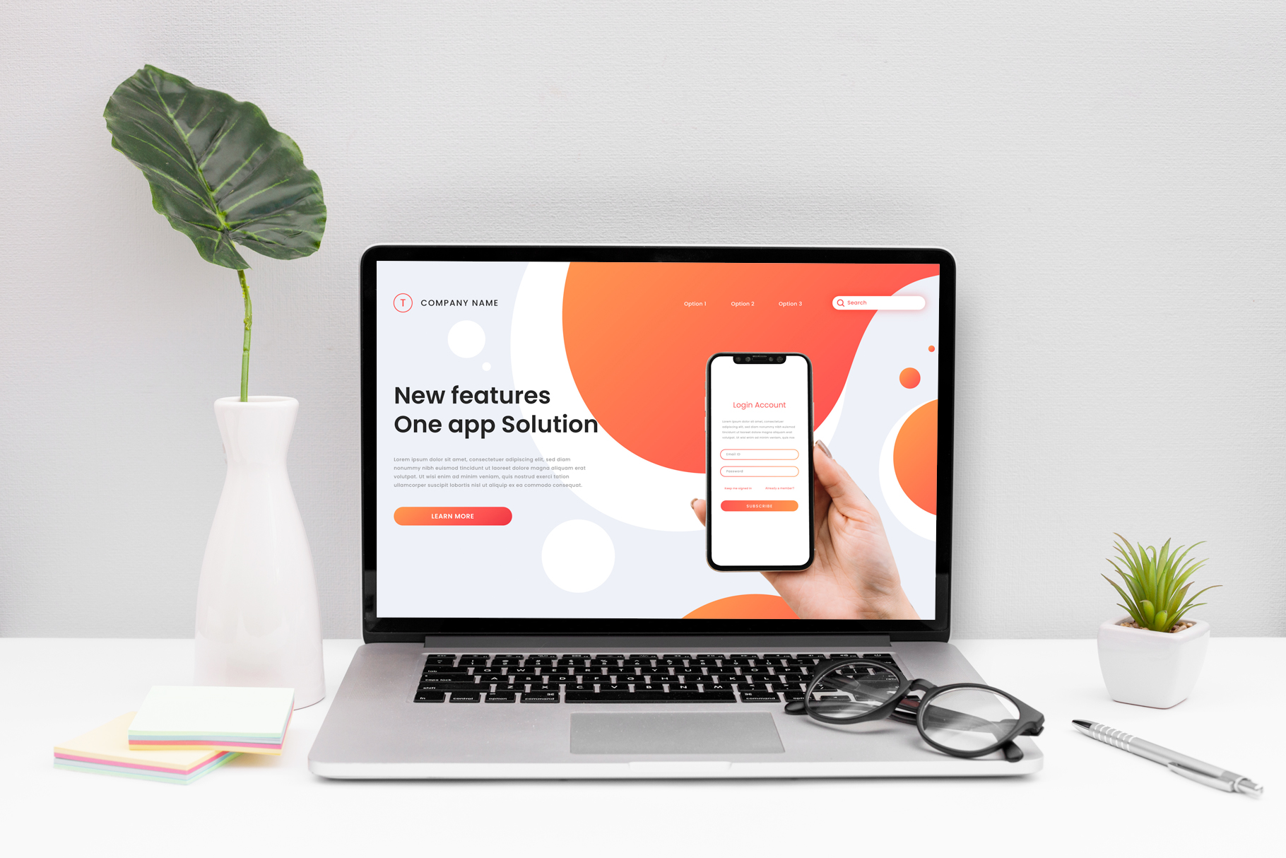
Visual Creativity: These days, visuals appeal to the audience much more than the content. If your landing page can make some use of visual designs, it is highly recommended to incorporate them. Make sure your website includes a good number of templates and images that keep the audience engaged and will help them feel connected with the content.
Offer Solutions and Benefits: Your webpage should offer solutions to your visitors that will help them find value in your content. This is one of the best ways to make them coming back to your webpage in search of answers and solutions that can truly help them. Moreover, this might motivate your customers to take great interest and share their thoughts and thus help in the development of your website.
Testimonials: It is extremely important to gather testimonials from your visitors and customers that will help you identify your weaknesses and work towards improving them. This would help you gather loyalty points around your target audience.
If these tips are put into place in the right manner, the chances of your website growing and rendering appropriate leads just get better.
Landing Page Comparisons
For better understanding, let us now compare a few landing pages that are not only able to attract new audiences but have also been able to retain their old customers and increase sales.
Uber: The Landing Page of Uber is quite crisp and convenient, leaving no scope for confusion. For instance, this time their landing page requires five fields of information, which are:
- First Name
- Last Name
- (Country Code) Mobile Number
- Password
The ‘promo code’ option is not really a necessity. Thus, it hasn’t been included among the five crucial information fields – making it a smart move! Above anything else, the old ‘sign-up’ option appears differently in green color along with an arrow indicating the users to reach the next page once they have filled up the details.
This helps the users enjoy a more user-friendly interface and thus have a smooth experience. Apparently, the ‘sign-up’ option has been replaced with the phrase- ‘get your ride now’ that appears to be more persuasive to the users.
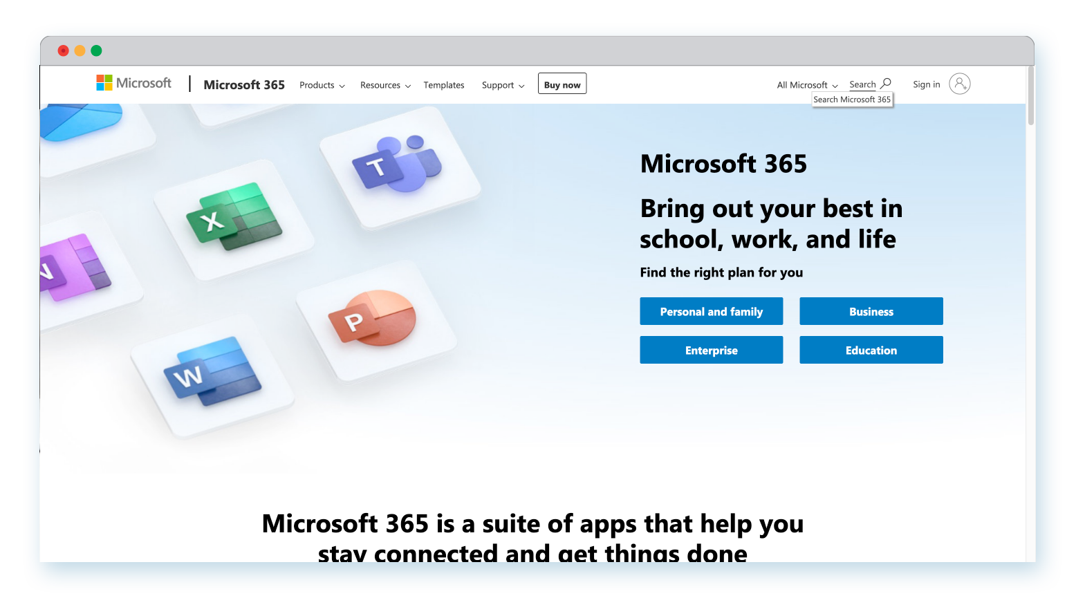
Microsoft: The headline that Microsoft displays makes it loud and clear how one can use the more productive side of their mobile phones with their Microsoft Office 365. They even offer e-books that provide better and in-depth knowledge. The chances of the conversion results to grow gets better with the images present inside the e-book. These are links that take us directly to the address we wish to visit.
The form present at the corner of the page stands out and doesn’t interfere with the rest of the information. Eventually, the call-to-action button matches well with the contrast of the entire website.
Microsoft Office 365 has been hyperlinked on top of the screen and can help take the visitors to the page without even the need to fill out their contact details.
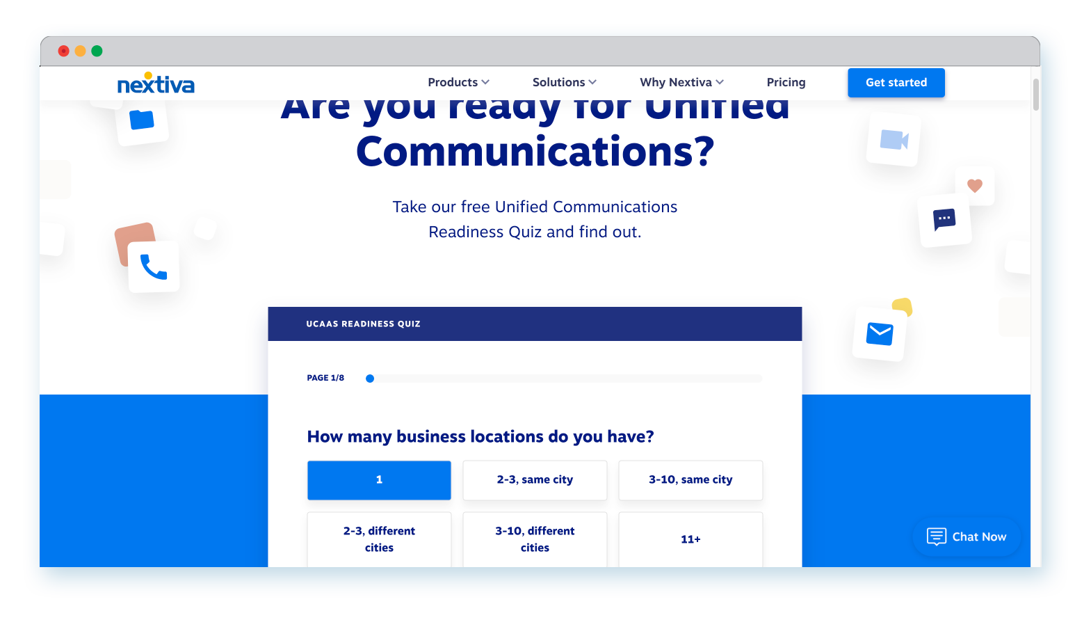
Nextiva: Nextiva has recently replaced their old Google form with quizzes that are much more interesting and quite useful in terms of marketing. As an IP software company, they have given serious thought to filter their audience. They have implemented methods that not only attract newer audiences but also ensured that they grab their attention by offering quality content.
Another amazing way to ensure that your visitors stay engaged is by building more interactive pages and not forcing them to fill up forms or take quizzes. This is extremely important when the forms consisted of more than 2-3 fields to be filled out.
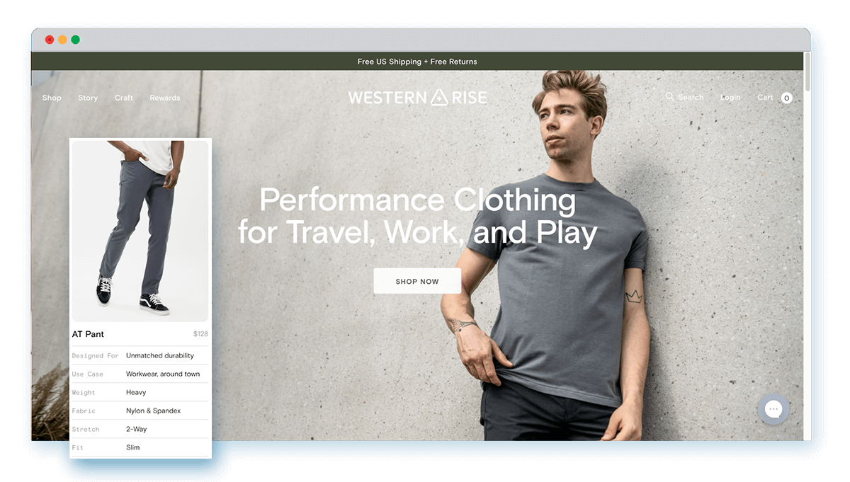
Western Rise: Western Rise, a well-known e-commerce website has worked upon their idea of generating better leads by working upon their visual creativity. Content indeed is one of the most crucial factors, but visual creativity can work do wonders to your conversions as well. Especially, when we are talking about e-commerce!
Lately, Western Rise, on its landing page, has come up with images along with detailed product descriptions so that it is easier for the viewers to find what they are looking for. The visual creativity went a notch higher by the inclusion of actual models wearing Western Rise clothes and beneath them lay in the product description that isn’t very extensive, but short, precise, and crisp. Exactly just the amount of information people required! The older pages of Western Rise did not include all of these meticulous details.
However, now Western Rise doesn’t just have a better visual performance, but it has also worked with equal excellence on headline and captions. As mentioned earlier, one cannot underestimate the importance of headlines and captions in today’s time of people with a short attention span!
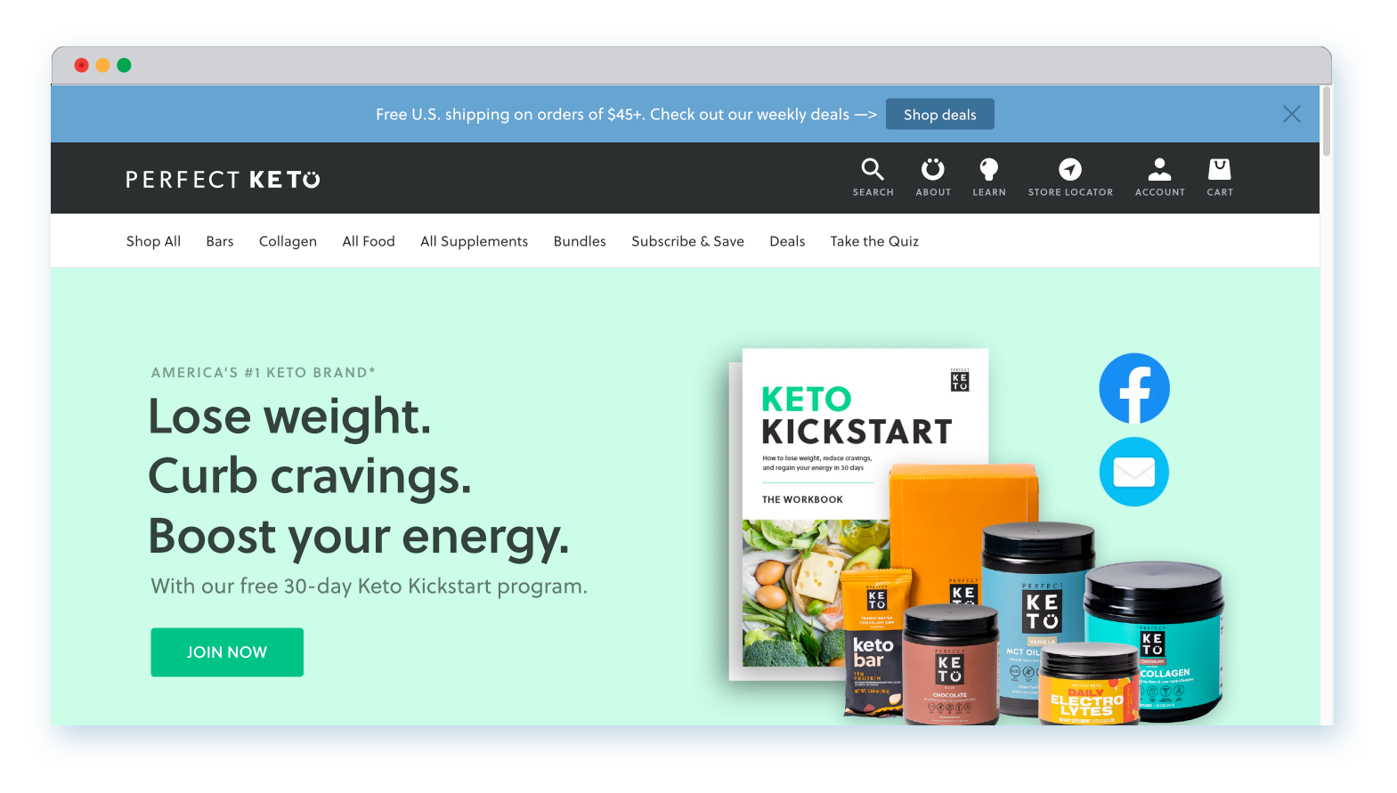
Perfect Keto: As a part of the supplement industry, Perfect Keto has worked upon its fold content. One must understand how important fold content is when it comes to decision-making.
Their entire menu section was designed from scratch. In addition to that, Perfect Keto also incorporated customer and brand testimonials so that they could help them generate leads and build trust with their potential future clientele.
While the old webpage totally missed vital components that are usually expected from a website, this time, Perfect Keto re-created a headline that clearly stated the purpose of their company and their products. Sections were added where the customers could educate themselves about the brand. And what boldly stood out was the brand, customer, and influencer collaborations that helped create trust among potential customers and advertise their page. When layers like these are put into action, there is always a scope for good results.
Summary
To summarize all that is expected from a landing page to convert, we can say that:
- Identify The Problem. If you feel your landing page is lacking in content, make sure you add in information that convinces your audience. For that, pay attention to the small parts like- heading, captions, bullets, etc. These small words or phrases can render a huge impact on the entire reputation of your company.
- Compare. Have a look at your competitors’ websites that are doing well. See what and where are you going wrong so that you work on filling the gaps of your website right away.
- Add Visual Content. Audiences these days prefer a more personal approach. Brief them about your company through a video. Add in templates, icons, etc. so that it appeals better to the audience’s eyes.
- Ask for Feedback. Request for client and brand testimonials or reviews to know your mistakes and ensure that you offering quality services to your clients.
Remember, everything starts with your website. So, if that is great, the rest will flow naturally. We hope that at least one of these tips will help you know more about landing pages and how you can improve conversions with just a few changes.
For further insights, you can consider our Dallas website design agency to avail best-in-class services that will help you build a landing page for better conversions in the coming year. Click here to get a quote today!