Home / Functional Web Design / Google Trends / Checkout Page Optimization – Streamline the Checkout Steps and Increase Conversion Rate
The checkout process is one of the most important aspects of any professional eCommerce website. It’s the final step in the customer journey, and it’s where you convert prospects into paying customers. That’s why it’s so important to make sure that your checkout form is optimized for conversion. No matter what kind of store you have, one thing is sure — if your conversion rate isn’t high enough to generate sales then customers won’t be coming in droves. But once traffic starts flowing into the doors and generating revenue for stores through purchases…the next step becomes converting these visitors into loyal consumers who will keep returning time after time by maintaining an above-average level cart abandonment rates!
Offer single-page checkout:
One-page checkout is undoubtedly the best way to go if you want to keep your customers engaged until the very end. By having all the information visible right from the start, you eliminate any confusion or hesitation a customer might feel. This way, they can see exactly what they need to do and how long it will take them. Additionally, a single-page checkout helps to prevent shopping cart abandonment as it is less likely for a customer to get lost or frustrated during the process. If your WooCommerce theme doesn’t have a one-page checkout option, don’t worry – there are plenty of plugins that will allow you to add this functionality to your site. In short, a one-page checkout is the easiest way to optimize your web pages for conversions and ensure that your customers have a positive experience from start to finish.
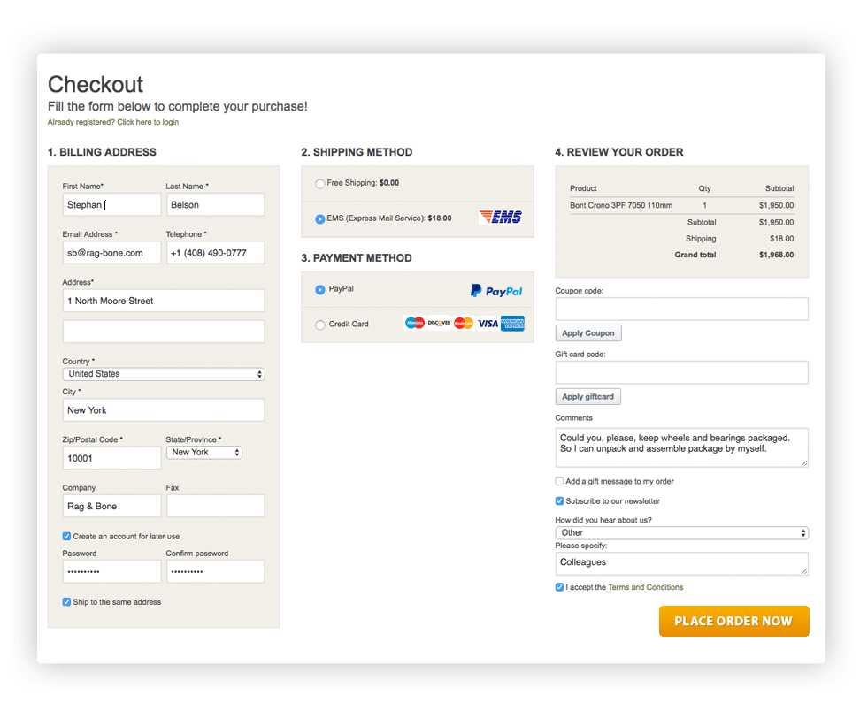
There are several advantages of single-page checkout. It’s faster and simpler for customers to checkout on a single page, rather than having to go through multiple pages. This means less time wasted on checkout and fewer chances for customers to get distracted and leave the process unfinished.
Single-page checkout is more efficient for merchants. With fewer pages to load, there is less chance for errors and customers can complete their purchase more quickly. This also reduces the load on your server, making your website run more smoothly.
Single-page checkout is more secure. By collecting all the customer information in one place, you can be sure that all the data is accurate and that no sensitive information is accidentally revealed. This helps to protect both your customers’ privacy and your business from fraud.
It’s faster, simpler, and more efficient for both customers and merchants alike. If you’re looking for a more streamlined checkout experience for your website, consider using a single-page checkout solution.
Offer guest checkout functionality:
Checkout is one of the most important steps in the eCommerce process, and it’s important to make it as easy and user-friendly as possible. One way to do this is to allow visitors to checkout as guests. This eliminates the need for them to create an account, which can be especially helpful for first-time visitors who may not be sure if they’ll return. Another option is to allow social login, which allows customers to sign up with an existing account like Google, Apple, or Facebook. This makes checkout even easier, as they don’t have to create a new account or remember another password and email combination. Either way, following this checkout optimization tip can help improve your conversion rate and customer satisfaction.
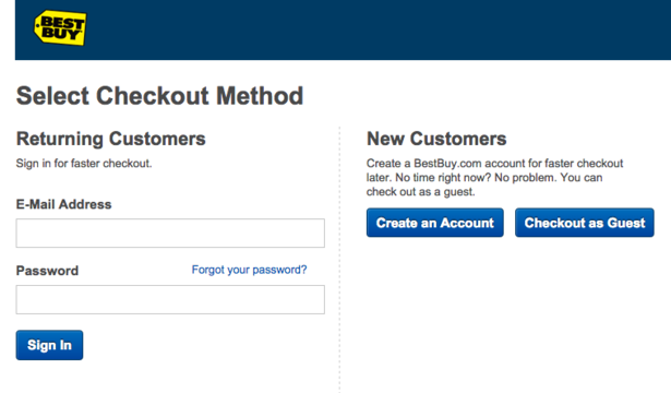
Guest checkout allows customers to purchase items from your store without having to create an account. While some people may be hesitant to use this feature because they’re worried about the security of their information, there are actually a number of advantages to offering guest checkout.
First, guest checkout makes it easier for customers to buy items from your store. They don’t have to go through the hassle of creating an account and entering their personal information. This can be especially helpful for customers who are just browsing your store and don’t want to go through the hassle of creating an account.
Second, guest checkout helps improve customer loyalty. When customers have an easy way to buy items from your store, they’re more likely to come back and buy again in the future. And since they don’t have to create an account each time they buy something, they’re more likely to return sooner rather than later.
Third, guest checkout can help increase your conversion rate. When customers see that it’s easy to buy items from your store without having to create an account, they’re more likely to buy something. This is because they don’t have anything holding them back and they know that their information is safe and secure.
Overall, there are a number of advantages to offering guest checkout in e-commerce. It makes it easier for customers to buy items from your store, it helps improve customer loyalty, and it can help increase your conversion rate. If you’re looking for an easy way to boost your e-commerce business, consider offering guest checkout.
Reduce unwanted form fields:
One way to optimize your checkout form is to make sure that you’re only asking for essential information. For example, if you’re selling digital products, you probably don’t need the customer’s shipping address or phone number. By only asking for the information that you absolutely need, you can streamline the checkout process and make it more streamlined and user-friendly.

Another way to optimize your checkout form is to use inline validation. This means that as the customer is filling out the form, they will get immediate feedback on whether or not they are entering valid information. This helps to reduce friction during the checkout process and makes it more likely that customers will complete their purchase.
By taking a look at your checkout form and evaluating all of the fields there, you can make sure that you’re only asking for essential information. This will help to streamline the checkout process and make it more user-friendly, which will ultimately lead to more conversions.
Display Security badges and icons:
Your website is one of the most important aspects of your online presence. It’s where your customers go to learn more about you, your products and services, and how to contact you. It’s also where they go to make purchases.
One of the most important things you can do to ensure your website is safe for your customers is to display a Security badge. This tells them that your website has been verified as secure, and that their information will be protected when they enter it.
When choosing a Security badge, be sure to select one from a reputable provider. There are many different types of Security badges available, so be sure to select one that meets the needs of your business.

Displaying a Security badge on your website is one of the best ways to ensure your customers feel safe doing business with you. It tells them that you take their security seriously, and that their information is protected.
Your customers want to feel safe when they checkout on your site. You can make them feel secure by adding prominent security badges, such as secure checkout guarantees and links to your shipping costs, shipping options, and return policies. Adding these will increase not only your conversion rate but also the chances of first-time visitors becoming loyal customers. Another way to make your customers feel secure is by using SSL trust badges on the checkout page. This will put their mind at ease and make them feel secure in their buying decision.
Display steps in the checkout process:
When it comes to e-commerce, the checkout process is one of the most important aspects of the entire website. After all, this is the point where customers provide their payment information and complete the purchase. It’s essential that this process be as smooth and easy as possible for customers, or they may be less likely to return in the future.
One way to ensure a smooth checkout process is by implementing multiple steps. This means that customers are not asked to provide all of their payment information at once, but rather in stages. This makes the process less overwhelming for them and can help reduce the chances of errors. Single-page checkout can simplify the process and make it more user-friendly, leading to more sales. However, sometimes switching to a single-page checkout isn’t an option. In that case, consider adding a progress bar to show how many steps there are in the checkout. This can help to improve the user experience and make it clear how close they are to completing the purchase. As a result, it can lead to more sales and a higher conversion rate.
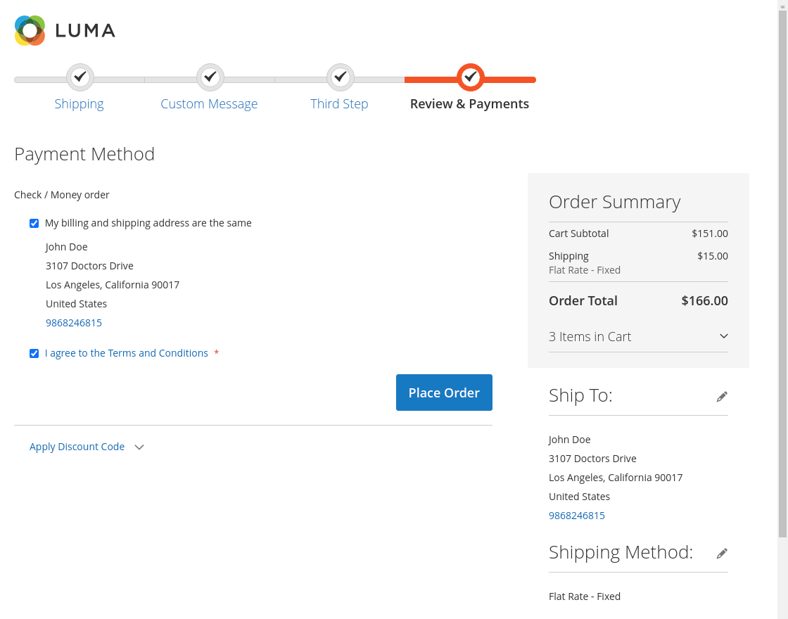
There are several benefits to using multiple steps in the checkout process:
a. It makes the process easier for customers. Breaking up the checkout process into multiple steps makes it less daunting for customers and can help reduce the chances of errors.
b. It can help reduce cart abandonment rates. When customers are able to complete the purchase in several easy steps, they’re less likely to abandon their cart altogether.
c. It can improve conversion rates. Having a smooth and easy checkout process is crucial for converting visitors into paying customers. Multiple steps can help ensure that this process is as streamlined as possible.
Enable multiple payment options:
This is a common problem that many online shoppers face. They find the perfect product, but when they go to checkout, they discover that the site doesn’t accept their payment method. This can be incredibly frustrating, and it often leads to customers abandoning their carts altogether.
The solution to this problem is simple: offer multiple payment options. The more options you provide, the more likely customers are to find a method that works for them. This will help to increase sales and reduce cart abandonment.
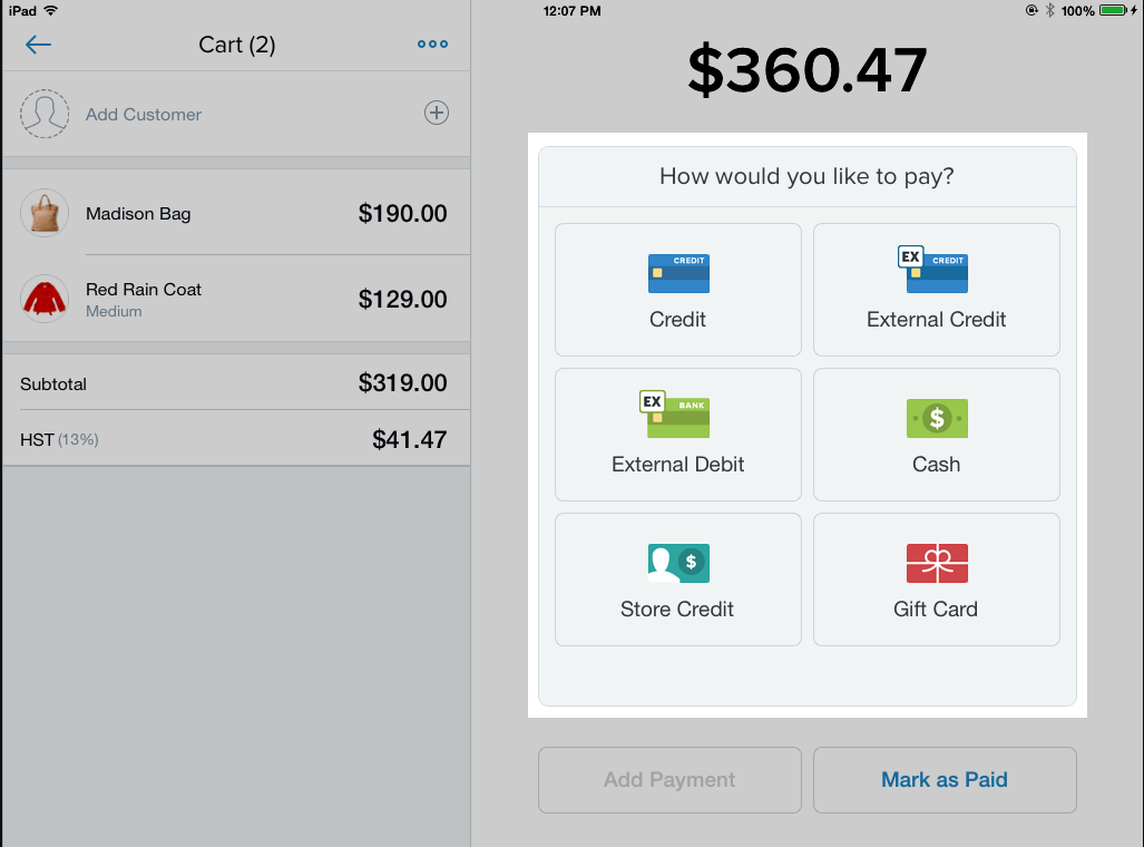
There are a number of different payment options available, so there’s sure to be one that will work for your customers. Some common options include credit cards, PayPal, and bank transfers. By offering a variety of payment methods, you can make it easy for customers to pay for your products, no matter what their preferred method may be.
Enable shopping cart abandonment follow-up:
Sad but true: no matter how much you try, you can never fully eliminate instances of abandoned carts and lost sales. But you can significantly reduce them by setting up cart abandonment emails. These are emails that go out at a specific interval and remind customers to come back and complete the purchase. The first email typically goes out within 12-24 hours, and subsequent emails can be configured to go out in 24 or 48-hour periods. This gives customers a gentle reminder to come back and finish checkout, without bombarding them with too many messages. By taking this proactive approach, you can greatly reduce the number of abandoned carts and lost sales.
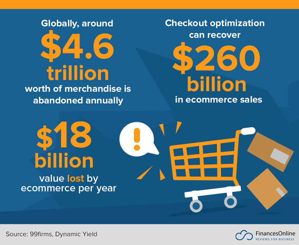
There are a few advantages of using shopping cart abandonment follow-up as a marketing tactic:
a. It can help recapture lost sales. According to a study by Forrester, around 69% of shoppers who add items to their cart but don’t complete a purchase do so because they get distracted or find a better deal elsewhere. If you reach out to those customers with a reminder or special offer, you may be able to get them to come back and buy what they originally intended to.
b. It can increase customer loyalty. When you show that you care about your customers’ experience and are willing to go the extra mile to make sure they’re happy, they’re likely to be more loyal in the future.
c. It can help build brand awareness. By reminding customers of your brand and getting them thinking about your products, you may increase their likelihood of buying from you in the future.
Remove distractions:
When it comes to checkout page optimization, one of the most important things you can do is to eliminate distractions. In today’s world, we’re constantly bombarded with notifications and updates begging for our attention. This can make it very difficult to focus on anything, let alone complete the checkout process. That’s why it’s so important to create a distraction-free checkout page. A few ideas for doing this include removing links to social media profiles, getting rid of the header and footer, eliminating email signup forms, and removing the main navigation menu. When there are no distractions, customers are much more likely to complete the checkout process. This can result in a significant increase in sales and conversions for your business.

When your potential customer is checking out at a store, the last thing they want is for something to distract them from completing their purchase. Unfortunately, there are a lot of potential distractions that can occur during this process. Here are some of the advantages of eliminating distractions during checkout:
a. Your customers would be able to complete their purchase more quickly.
b. They will be less likely to forget something important.
3. They probably will not make a mistake while checking out.
4. They will not be taken advantage of by sales clerks.
If you’re not optimizing your checkout experience, you’re leaving money on the table. By improving your checkout flow, you can increase conversions and boost your bottom line.
There are several ways to optimize your checkout, including switching to a single-page checkout, offering guest checkout, and offering multiple payment options. You should also eliminate distractions from your checkout page so that customers can focus on completing their purchases.
Implementing these checkout optimization tips can be crucial for increasing conversions and growing your business. With the right tools in place, you can make the changes needed to improve your bottom line.


