As designers, we know the weight our tools carry. We’ve all felt that bond with Adobe, its suite becoming almost second nature to us. But there’s a gentle buzz in the design community these days about Figma and for good reasons. Think about the days when you just wish everything was in one place, where designs come alive without friction and team collaboration feels like a coffee chat instead of a formal meeting. That’s what Figma offers.
And it’s not just anecdotal evidence. The stats are there:
- Figma’s surge in the market has been hard to ignore, compelling even the most dedicated Adobe users to peek over the fence.
- With its growing global user base, it’s clear that Figma isn’t just a fleeting trend; it’s setting new standards.
Why is there this gradual tilt towards Figma over Adobe? It goes beyond mere features. It’s about the fresh approach Figma brings to the table, addressing some unspoken needs we designers have felt for a while.
From Bless Web Designs‘ extensive experience crafting premium digital experiences, our take on the Figma vs. Adobe debate is backed by years of industry insight. As a leading web design firm in Dallas, our hands-on engagement with various design tools uniquely positions us to offer a balanced and authoritative perspective on this topic.
Figma: A New Era of Design
Figma swiftly became a pivotal point in the design conversation since its introduction in 2016. Breaking the mold, Figma transitioned away from traditional software constraints, choosing instead a cloud-first approach. Allowing designs straight from a web browser, Figma made design flexible and turned anywhere into a designer’s workspace.
By 2019, Figma’s appeal was undeniable, as it began appearing in more designer toolkits. A testament to its prowess? A valuation that surged to $20 billion by 2022, buoyed by hefty investments and a thriving community.
The power of Figma caught the attention of industry giants, with companies like Microsoft integrating it into their design processes. But the pinnacle of its influence was when Adobe, a dominant force in the design sector, acquired Figma for a staggering $20 billion. As the lines blur between these mammoths, a new chapter in design beckons.
10 Reasons Why You Must Choose Figma over Adobe
When deciding between Figma and Adobe, it’s more than just comparing tools—it’s considering the whole design journey. Here are 11 solid reasons why many designers choose Figma over Adobe.
Cloud Advantage
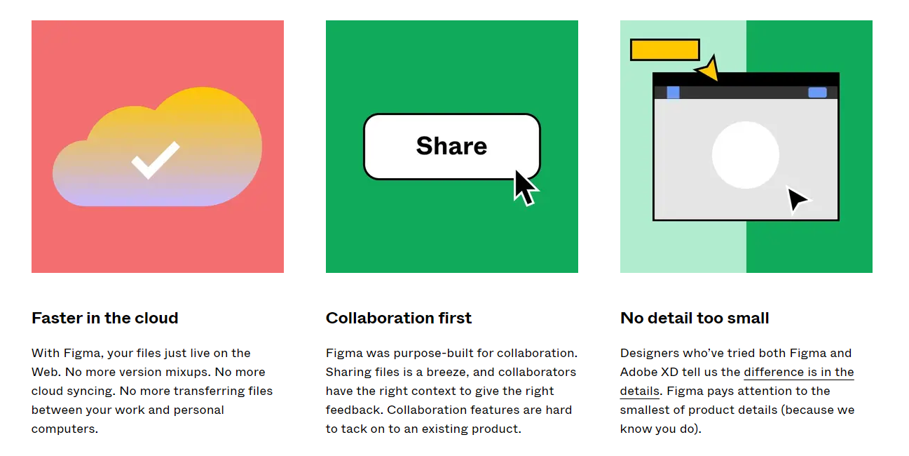
In the digital design arena, having a tool that offers seamless access without the shackles of traditional software installations is invaluable. Here’s where Figma shines brighter than Adobe. Figma’s entire platform is based in the cloud. This means no waiting for hefty downloads, taking up valuable storage space, and no version discrepancies because a team member still needs to update their software. Simply open your browser, and you’re good to go. This is a game-changer, especially for professionals who are often on the move, juggling multiple devices.
In contrast, while Adobe does provide cloud solutions, Figma is more fluid and hassle-free. Users of Adobe often find themselves dedicating significant time to updates, managing storage, and ensuring that every collaborator is on the same software version. Hence, the cloud advantage isn’t just about storage or access—it enhances the design workflow. And in this realm, Figma holds the edge over Adobe.
Effortless Collaboration
You can no longer play solo in the design domain. With increasingly complex projects demanding diverse skills, collaboration has become the linchpin of success. As a result, Figma understands this paradigm shift and has positioned itself as the go-to tool for collaborative design.
Right out of the gate, Figma’s cloud infrastructure simplifies collaboration to an unprecedented degree. Teams can collaborate on a project at the same time, witnessing live updates. No more swapping files or dealing with “final_v2_revised_edited” filenames. Adobe’s collaboration could have hit better regarding this real-time ease and fluidity. Each collaborator’s cursor is color-coded and labeled, allowing team members to see who’s doing what eliminating any overlap or confusion.
Contrast this with Adobe’s approach, which, although improved over the years, still needs to match the intuitive nature of Figma. Adobe projects typically require designers to work in isolation and merge changes, risking overwrites and lost work. This disjointed approach can lead to delays and misunderstandings, which could be more conducive to tight deadlines or high-stakes projects. Figma also allows for instantaneous feedback. Stakeholders can drop comments directly onto the design, specifying their referencing element. This clear line of communication negates the need for lengthy email threads or feedback sessions, ensuring everyone’s on the same page.
Moreover, Figma’s browser-based platform means anyone without a Figma account can jump into a file and provide insights. There’s no need for special permissions or software installations. In the era where design is a team sport, Figma ensures that every player can contribute seamlessly and effectively regardless of their role. With its legacy structure, Adobe needs help providing the same fluidity level that Figma offers.
Easy Integration
The strength of a design tool lies not only in its individual features but also in its ability to connect with other platforms and systems smoothly. Figma gets an edge in this respect, underscoring its commitment to a holistic design experience. Figma’s open API is a game-changer. It encourages third-party developers to create plugins and extensions tailored to specific needs. This means that, instead of waiting for the core Figma team to implement a feature, the broader community often develops solutions, enriching the platform continuously. While Adobe supports plugins, Figma’s more inclusive and communal approach accelerates innovation and customization.
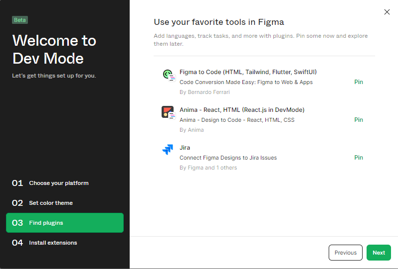
Apart from plugins, Figma’s teamwork-oriented approach also includes connections with leading project management and communication platforms. Pairing Figma with platforms like Slack, Jira, or Trello is a breeze, ensuring that design updates and feedback loops are woven directly into daily workflows. Adobe’s suite, on the other hand, leans heavily on its proprietary ecosystem, which can sometimes make external integrations less intuitive. Furthermore, Figma’s web-based nature ensures that it can be accessed from any device with a browser. This offers added flexibility when integrating with web-based platforms or pulling assets directly from the web.
Versatile Prototyping
Prototyping is the bridge that takes raw ideas from concept sketches to tangible interfaces, providing a playground for designers to experiment, refine, and validate. Figma’s prototyping capabilities have been meticulously crafted, demonstrating a profound understanding of designers’ needs and offering an intuitive and robust depth. One of Figma’s standout features is its frame-to-frame animation. Designers can create fluid transitions instead of static jumps between screens, making the prototype feel closer to the finished product. This incredibly benefits user testing, providing a more authentic experience for testers and stakeholders.
The interactive components in Figma take modularity to the next level. Designers can design a part once—a button, a toggle, or a slider—and then define its various states. When this component is used in prototyping, it can change states based on user interaction. Thus, Figma’s stance on prototyping goes beyond mere functionality—shaping user experiences. Figma’s vector networks offer unparalleled flexibility, a significant departure from traditional pen tools. They allow designers to craft complex curves and shapes precisely, ensuring that prototypes aren’t just functional and aesthetically top-tier. Meanwhile, consider Adobe’s approach, which can often feel segmented. The process could be more streamlined with separate tools like Adobe XD for prototyping and Illustrator for vector design. Figma housing these features under one roof ensures that the prototyping phase seamlessly extends the design process rather than a separate endeavor.
So, Figma’s approach to prototyping isn’t just about functionality—it’s about crafting experiences. By offering versatile tools that cater to both the logical and aesthetic aspects of design, Figma underscores its commitment to empowering designers to create the best possible prototypes.
User-Friendly Interface
The interface of any design tool serves as the primary touchpoint for a designer; it’s the canvas, the workspace, and the control center all rolled into one. Thus, ensuring this environment is both intuitive and paramount. In this domain, Figma positions itself as a leader with a user interface that designers need and genuinely enjoy using.
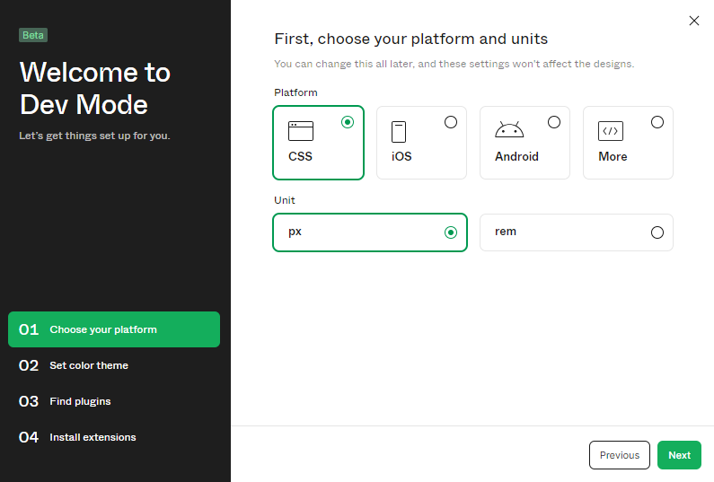
From the outset, Figma’s layout is clean, uncluttered, and free from overwhelming tools that can intimidate newcomers. This simplicity is deceptive, though. Beneath its minimalist exterior lies a powerhouse of features that can be accessed with just a few clicks or keyboard shortcuts. The tool panels are organized logically, with every element thoughtfully placed to minimize unnecessary movements or searches. Context-aware properties are another highlight. When you select an object, Figma displays only the relevant tools and options, reducing cognitive load and allowing designers to focus solely on their creations. This contrasts with some of Adobe’s offerings, where the sheer breadth of tools can sometimes lead to a steep learning curve.
Additionally, Figma’s approach to layers is commendable. Allowing users to drag, drop, and organize their layers intuitively eliminates the guesswork often associated with hierarchical designs. As you make adjustments to craft a quality user interface, real-time feedback ensures that you’re always in control, making real-time decisions without the need to preview constantly. Consistency is a golden rule in design. Figma’s style and components system ensures that once a designer defines fonts, colors, or other design elements, they can be reused consistently throughout the design. It’s a streamlined approach, cutting down repetitive tasks and ensuring uniformity. Figma’s user-friendly interface results from meticulous design decisions, keeping the designer at the heart of the experience. The tool understands that an intuitive workspace isn’t just about getting the job done—it’s about enjoying the journey of creation.
Design System Maintenance
Maintaining an updated and efficient design system is crucial in the ever-evolving design world. It’s the foundation upon which a product’s design consistency rests. Figma takes an intuitive approach to design system maintenance, making it considerably more manageable than many of Adobe’s offerings. Figma’s shared libraries are a game-changer. They enable designers to house components, styles, and patterns in a central location accessible to anyone on the team. As design elements get updated, every instance across all projects reflects the change, ensuring up-to-date and consistent design.
Contrast this with some of Adobe’s software solutions, where managing a comprehensive design system can often feel siloed or compartmentalized. In such environments, changing one component might require manual updates across multiple files, increasing the risk of inconsistencies and errors. Another standout feature in Figma is the use of variants. Designers can group related components and then define property variations, allowing for a structured yet flexible component system. This makes maintaining a complex design system manageable, as tweaking a primary component cascades changes to its variants, ensuring a consistent user experience.
Audit tools in Figma further bolster its supremacy in design system maintenance. They allow teams to scan projects for inconsistencies, such as outdated components or styles that deviate from the established design system. This forward-thinking strategy ensures early identification of potential issues, saving significant time.
Broad Compatibility
When choosing design tools, the ability to function seamlessly across different platforms becomes crucial. Figma’s superiority over Adobe is prominently visible thanks to its all-encompassing compatibility. Being browser-based, Figma effortlessly serves Mac, Windows, and Linux users. There’s no software restriction based on the operating system. An issue occasionally faced with specific Adobe tools.
As discussed in the second point, Figma’s open API is a beacon for third-party integrations. It empowers designers with flexibility, inviting them to tailor workflows, amplify features, and bridge the gap between design and code. While Adobe provides integrations, Figma’s vast ecosystem presents more expansive opportunities. On the front of file management, Figma stands tall. Need to export as SVG for a flexible design? Or a JPEG for sharp display? Figma makes it simple. Plus, directly pulling in Sketch files reduces barriers when joining forces with those who swear by Sketch.
For teams that rely on real-time communication, Figma’s effortless synergy with platforms like Slack and Jira ensures design conversations flow seamlessly into broader project discussions. In contrast, Adobe’s suite often leans on additional plugins for such integrations. Figma isn’t just keeping pace with compatibility standards—it’s defining them. While Adobe has strengths in effortlessly aligning with diverse tech environments and processes, Figma stands out.
Smooth Transition
One paramount concern when switching design tools is the transition curve. It’s not merely about learning a new tool but about translating past projects, assets, and experiences into a new environment. Figma’s ascendancy over Adobe is marked by its commendable approach to ensuring a seamless shift. Figma acknowledges the challenges designers face when making a tool switch. Recognizing the industry’s reliance on tools like Adobe XD or Photoshop, Figma offers direct import features. This means designers can bring their Adobe XD and Sketch files straight into Figma without losing intricate design details or facing conversion issues.
Due to its inherent UI, getting the hang of Figma doesn’t feel like starting from scratch for designers accustomed to Adobe’s ecosystem. Tools, icons, and workflow are arranged to feel familiar yet refreshing. The gentle learning curve is a breath of fresh air for those tired of steep, lengthy adjustments. Moreover, the abundance of community-driven tutorials, resources, and templates makes the journey to mastering Figma quicker. While Adobe has its learning resources, the communal sharing spirit seen among Figma users is in a league of its own.
Community and Plugins
One of Figma’s most notable strengths over Adobe lies in its vibrant community and the array of plugins it offers. Figma’s ascent has been remarkable, and much of its triumph is credited to its vibrant community of dedicated designers and developers. Figma’s community platform is a goldmine. It’s a hub where designers from all over the globe converge to share templates, discuss best practices, showcase projects, and offer constructive feedback. Unlike Adobe’s more segmented communities tied to individual applications, Figma’s singular platform brings everyone together. This focus creates a more concentrated pool of knowledge and resources, making it easier for users to find what they need or get the help they want.
Then, there’s the world of plugins. Adobe has its share, but Figma’s approach to plugins is unique. Being a web-based tool, Figma has been able to leverage the vast world of web technologies. Developers have quickly populated Figma’s plugin store with tools ranging from automated layout adjustments to real-time content generation. These plugins are not just add-ons but game-changers that supercharge the design process.
Accessible Testing
One of the most crucial aspects of design is testing, ensuring designs look good and work seamlessly for the end-user. Figma trumps Adobe in this department by making testing a feature and an integral, easily accessible part of the design process. With Figma, testing is a more manageable affair. Given its cloud-based nature, designers can instantaneously share a clickable prototype for user testing. Just send a link, and your testers – clients, teammates, or stakeholders – can instantly engage with the design without downloading anything. There’s no software barrier to entry, making the feedback loop much quicker and smoother than with Adobe’s suite.
Furthermore, Figma’s ‘Observer’ mode facilitates real-time viewing. This means that while a tester interacts with the prototype, designers can watch in real-time, gaining immediate insights into user behavior and interaction pain points. Adobe tools, while evolving, still need this seamless integration and real-time observation capability. Plus, when it comes to accessibility standards, Figma has integrated tools to check designs against WCAG standards, ensuring that your designs are functional and accessible to all users, including those with disabilities.
Summary
Switching from Adobe to Figma might seem daunting, but the advantages are undeniable. From cloud accessibility to versatile prototyping, Figma consistently edges out its competition in today’s design ecosystem. As stated, choosing Figma can be a game-changer for designers wanting a seamless, powerful, and efficient design experience. For those still on the fence, leaping with Figma can redefine your design approach.
Contact our design team if you’re contemplating this move or looking to maximize Figma in your design process. Let us help you unlock Figma’s full potential and guide you to a smoother design journey.
FAQs
Is Figma going to replace Adobe XD?
Figma and Adobe XD serve similar purposes, but whether one replaces the other depends on user preference and specific project needs. Both will likely coexist in the design market.
Do UX designers use Figma or Adobe XD?
UX designers use both Figma and Adobe XD. The choice often depends on team collaboration needs, platform familiarity, and project requirements.
Does a graphic designer use Figma?
Yes, graphic designers use Figma, especially for digital design projects and collaborative tasks, due to its cloud-based nature.
Does Figma compete with Canva?
Figma and Canva cater to different audiences. While Figma is more tailored to professional design and collaboration, Canva targets a broader audience with template-driven design solutions.
Can I sell Figma designs?
Yes, designers can create and sell Figma templates or UI kits on various online platforms if they comply with Figma’s terms of use.


